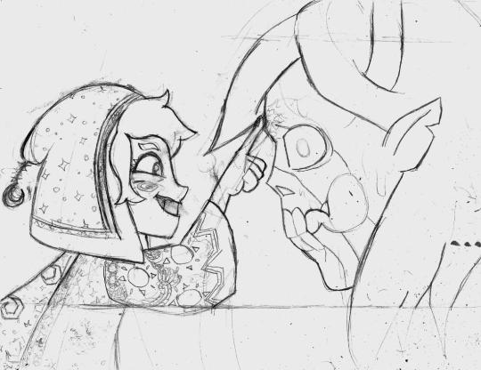
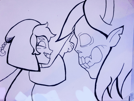
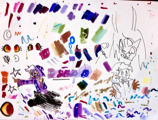
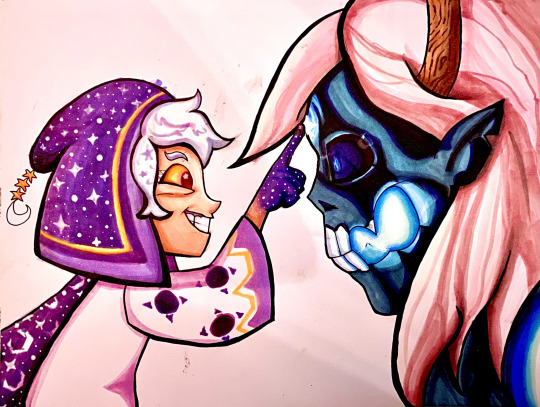
#did the lines for these on paper with a brush pen and then colored them digitally
Explore tagged Tumblr posts
Text


Redrew a couple achievement icons :]
(Originals under the cut)


#pizza tower#peppino spaghetti#pizza tower peppino#did the lines for these on paper with a brush pen and then colored them digitally#really fun process ngl
412 notes
·
View notes
Text
I see these types of posts every now and again, and it’s only just occurred to me to share some knowledge:
Lines
Lines are often the heart of drawings, and they tend to be the part artists will draw over and over and over again to get them juuuuussssssttttttttt right. Pointing out lines you think are well done will go a long way to compliment an artist.
Your lines are dynamic! (Good for action pictures, art of an intense scene, or art that conveys movement, like a character running)
Your lines are so clean! (Good for neat lines of various sizes. These lines will feel like a coloring book, where you could color inside them yourself if the art was black and white)
Your lines carry such depth! (When lines cross over each other, they make a flat picture look more real, almost like 3D)
You’re good at drawing intricate lines! (Curling lines? Curvy, wavy, bendy lines? Lines that weave around each other? Many, small lines detailing an item like filigree or a robot’s parts? Those are intricate lines, baby)
You make great use of line weight! (In general, the human eye will be drawn towards very thick lines. Artists will use this to make you focus on a certain point, like a character’s face, by using thick lines around the face and thinner lines everywhere else)
You do amazing lineless art! (Not all art has lines! If you see a picture without any lines, make sure to tell the artist you noticed their hard work!)
Your line colors are fantastic! (Not all lines are done in black or white. Some artists will spend a lot of time choosing what color to make their lines. Show them some love!)
Color
Your colors are so vibrant! (Bright colors! Colors that pop! Colors that instantly grab your attention!)
The saturation is great! (A very bright color is highly saturated, and a very dull color is low saturated. High saturation colors can hurt the eyes, so an artist with good saturation control knows how to use bright colors without hurting anyone’s eyes)
I love your color choices! (This can be used for all color schemes; it’s a more general compliment that praises the artists for their understanding of color theory)
Your colors feel like home! (Good for cozy colors. Warm colors that aren’t usually super bright. They make you feel all warm inside. If you picture a cozy cottage in the woods, you’d probably image these colors)
Your pastels are so pretty! (Muted colors usually fall into the category of “pastels”. These are soft colors that are meant to be calming and non-oppressive on your eyes. Think: The opposite of vibrant)
Your colors are so soft! (Similar to the above two, this is for a picture that makes you feel soft and warm and fuzzy inside. It’s more directed towards warm and pastel colors instead of vibrant colors)
Your ability to blend colors is fantastic! (Putting two different colors right next to each other can look jarring or choppy, so many artists will blend two or more colors together to make things look more natural and appealing. A good example is giving a character a subtle pink blush on their otherwise skin-colored cheeks)
You are super good at choosing color palettes! (Good for when the artists regularly chooses colors that just feel like they belong together. Best for when there are only a limited number of colors in the picture)
Your colors are so clean! (Layering color on top of color on top of color can make everything muddy and dull. Artists who blend things well will have “clean colors”. Likewise, some artists intentionally avoid blending to make simple, bold art, in which case their colors are very, very clean)
Light and Shadow
Conveying light and shadows can be really hard. It can take years to understand how lighting works, and it’s even harder to put your knowledge of it into practice. It can be done with colors, lines, textures, and many other ways.
Your lighting is so good! (A general compliment for any time you see good use of lighting. If you’re unsure, check the eyes and the face of the character, as they often have the most highlight to them)
You made great use of shadows here! (Good for when a dark area really captures your attention)
Your shadows feel so alive! (Artists can be really creative. They make dark areas that seem to move or curl or otherwise just be alive on the paper)
The lighting is so soft and gentle! (Like before, this is for art that just makes you feel soft inside! I think of a character maybe surrounded by light in a field of flowers when I imagine something like this)
You balance your shadows so well without making things too dark! (Using lots of dark colors to make shadows can make the picture hard to see, and details can get lost. If you see a picture with lots of shadows, but you can still easily see all the details, then the artists has really good balance and color control)
Your contrast of light and shadow is amazing! (Good for when the artists uses lots of both light and shadow! You often see pictures with a stark difference between the two, like a character standing in the light and the other falling into shadows, but you can also see good contrast in a more standard setting, like a city-scape set in the afternoon)
Details
Pointing out details is one of the fastest ways to make an artist feel seen. It’s harder to give examples for this because it will really, really boil down to the individual picture. The general rule is if you see something you like, say it! Try looking for things to point out, like:
A character’s expression (”She looks so angry!” or “His expression is so sad, I’m going to cry!” or “Wow! I can really tell what they’re thinking just from that expression alone!” or “You draw expressions so well!”)
Little things a character is doing/holding/etc. that may get overlooked (”I noticed you even clenched his fists! Good job!” or “I love her tiny hair clip!” or “You painted her nails to match his eye color! I love it!”)
Details in the background/landscape (”I love the little bird nest you included in the tree branches!” or “The way you draw water is so pretty! I wish I could swim in it!” or “Is that’s Character B’s hand in the background? So cool!” or “That is the softest cat; I want to pet it!” or “That food on the table is the tastiest thing I’ve ever seen!”)
Clothing! (”Her dress is so pretty!” or “Wow, you do such a good job drawing suits!” or “Her t-shirt is so funny!” or “That hat is so cute by the way!”)
The general idea here is just to say whatever comes to your mind, whether it be literally pointing out the obvious (example: “I love that you drew this character wearing a flower crown! Flowers are so pretty!”) or pointing out how the picture made you feel (example: “This picture makes me so happy, I wish I could eat it!”). Just say what you like about it. You don’t need to know fancy art terms. Saying “Your blues are so blue!” is a perfectly wonderful way to describe the three different shades of blue the artist used to draw an ocean. As long as you aren’t criticizing, you can’t really go wrong.
me, absolutely not an artist, desperately trying to articulate how much i like adore people's fanart: ouughgh the colors. there are so MANY of them!!!! and the lines,,,,,,,,,, they are made of lines.. impeccable
#this took longer to type than expected lol#there is so much to be said on such a topic#ive found that just saying 'very good' and pointing out a detail goes very far#'the flowers are very good!' or 'the eyes are very good!' or 'the lines are very good!'#and you can mix it up with synonym like 'fantastic' and 'wonderful' and 'beautiful' and even 'heart breaking'#art should make you have feelings and that includes sad and angry feelings. let the artist know the feelings came through#theres also a lot of overlap. shadows can be lines. lines can be colored. lighting shows details. etc etc#keysmashes also go a longggggg way and so do emojis like hearts and happy faces#i complimented an artist once by pointing out that they did a good job showing the character had curled their toes#and she reached out to me personally to thank me because i was the only person to mention it#and i think she had spent like half an hour working on that part? maybe? either way she felt seen and appreciated#which is the ultimate goal. let the artist know their time and effort didnt go to waste. you saw what they did and thank them for it#even if 100000 other people have already pointed out a detail you should also point out that detail. no such thing as too much love#and most compliments arent too weird. you can say you want to eat their art. you can say you want to bottle their art and drink it#you can say you want to print their art and hang it on your ceiling. you can say you want their art at your wedding#those are high compliments and arent seen as weird or obsessive#i told someone i made their art my desktop background at work and i think it melted their brain lol in a good way#also! you can point out the medium! if its done on paper with pen tell them they do beautiful traditional art!#if its done on a computer tell them they are great at digital art!#tell them their brush strokes are beautiful!#you can also just default to 'youre such a good artist!' and 'you draw so nice!' and 'you make great art!'#the word 'wow' also goes a long way. 'your lines are just so... wow!' or 'And those colors! wow!'#'id like to stare at this for the next 10 years please and thank you' is always a good one#just speak your mind and be kind#neo speaks#neo rambles#art#compliment your artist#compliment art#art appreciation
62K notes
·
View notes
Note
Hey, I was wondering if you had any starter tips for digital art? I'm a traditional artist and have been for years, but I was recently given a tablet and clip studio. I am having SUCH a hard time getting anything to look right: shaky lines, flat/too soft pieces, just an absolute childish mess every single time. I see all these gorgeous digital pieces and have NO IDEA how to get there.
Heya!
So, it's been a very very long time since I transitioned from traditional to digital art, but I DID do proper traditional for a few years; we're talking ink pens, color pencils, markers, watercolor, fancy papers, the works. I did some acrylic painting too but only monochrome (and before anyone asks, these works no longer exist so I can't share them) all that to say that I do have some experience with the former and definitely felt the learning curve when I changed to a tablet.
To get the unhelpful advice out of the way first: It's a different and unfamiliar medium, and there is probably nothing significant that you're "missing" about it except time and exploration. There are pillars to digital art just like there are in traditional art, but when it comes to personal process everyone has their quirks and habits - you gotta mess around and find what works for you. I suggest looking up tutorials and speedpaints on youtube even if you know all the basics or if the style you see doesn't appeal to you; just watching how others do their thing might help you figuring out how you would like to do yours!
Now, for the more practical advice:
-I don't know what kind of tablet you got, but assuming it's a non display, that's an extra hurdle you have to get over in developing the eye-hand coordination necessary to use it. This feels very alien at first but it shouldn't take longer than a few weeks to feel completely natural.
-On that note, if there is a significant size discrepancy between the tablet and the screen you are looking at, that might mess you up. Try adjusting the size of the CSP window so it fits the size of the actual drawing surface you are using more closely.
-Every drawing tablet's pen has pressure settings that can be tweaked to your liking, I for one always make it a little softer than the default.
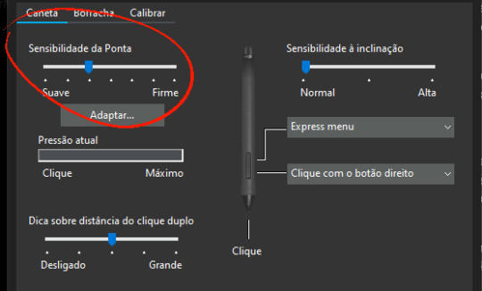
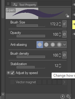
-BRUSH STABILIZATION! That's a setting every individual brush (and almost every tool, I believe) on CSP has. It does as advertised: stabilizes your brush strokes. A lot of people like this set between 8-20 depending on the brush, and it can make a huge difference to the way you draw.
It is usually always visible in the tool properties, but if not, you can toggle it on through the "sub tool details" menu by clicking the little wrench symbol on the bottom right.
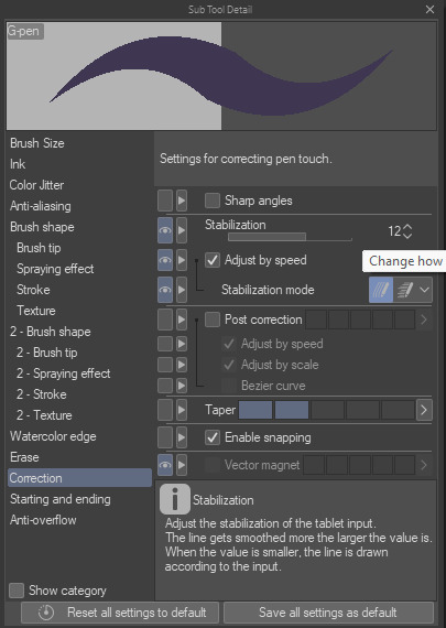
Hopefully this has been helpful at all. Good luck!
190 notes
·
View notes
Text
Guess what time it is…….

CENTIPEDE TIME !!! she’s finally real,,,,,,,, based off Scolopendra hardwickei or the Indian tiger centipede
Before I go about the process I just want to say you guys have been soooo incredible and I love reading your reblogs and I love the idea knowing I’ve inspired a lot of people,,, the project, although it was a lot of work and I’m feeling not so great as of posting this, still motivates me to want to make another.
(Art process below)
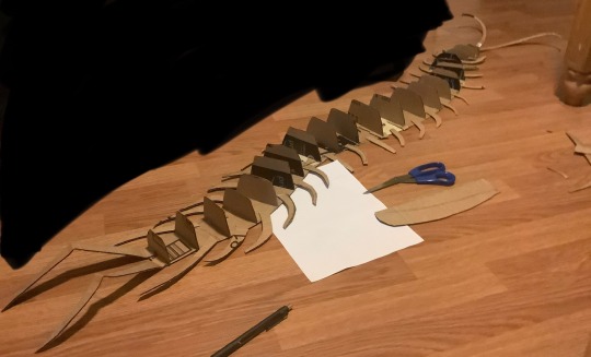
This was entirely freehanded! I have a lot of experience working in 3D art settings that this part came easy to me but I started with a flat base shaped in the pose I’d like the creature in. I used one whole piece cut from a shipping box and filled in the gaps with tape; you don’t need a single piece for the base but for structural integrity it helps a lot. As you can see here I also cut the legs separate and glued them on using hot glue. The vertical cross sections are to give an early support for the structure of the creature, think about the frames of aircraft or boats. During this part I used a pen to mark the width and height of the previous section to get a gradual flow of shapes.
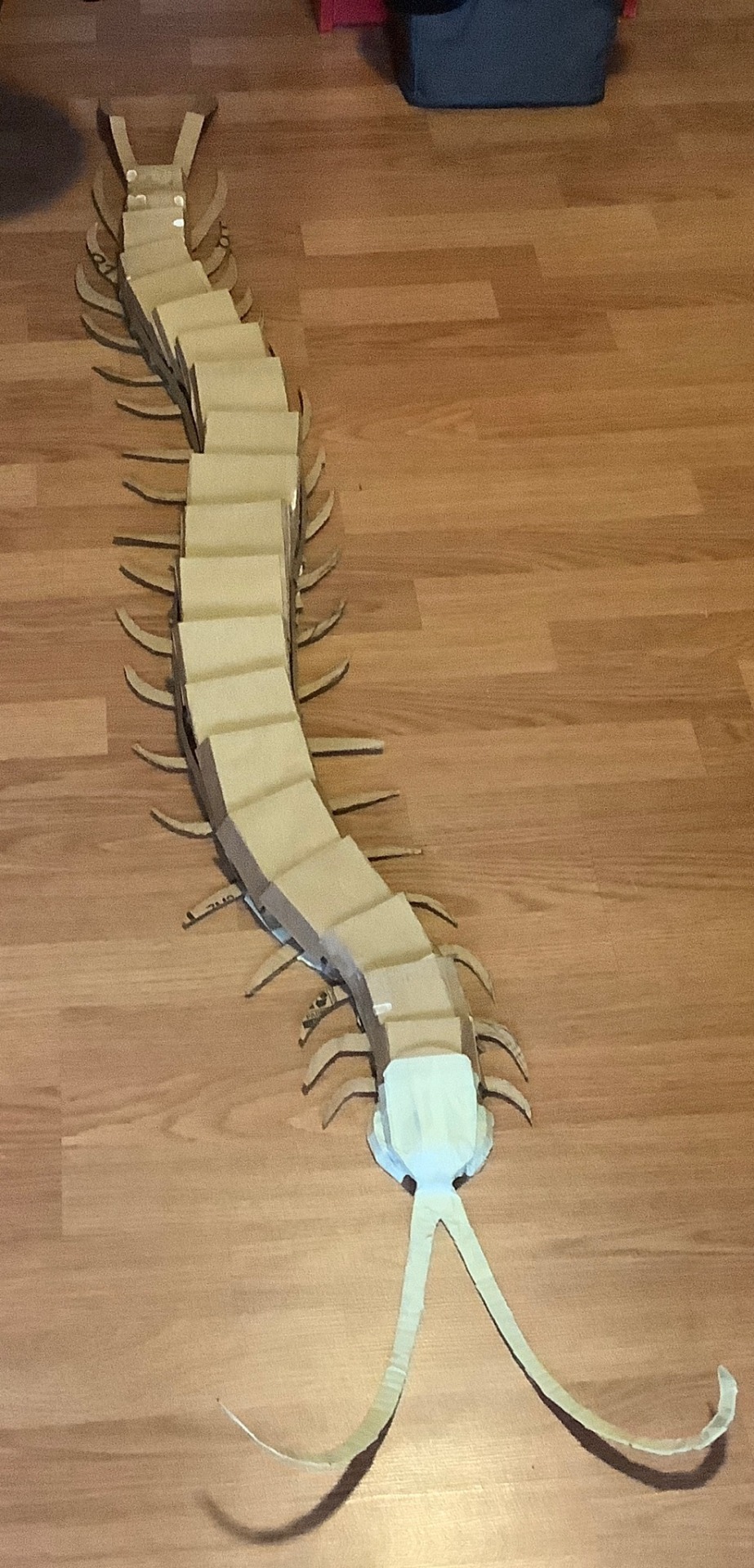
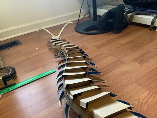
This next part I wish I got more documentation on but after the vertical cross sections I used soda boxes for the thinner and flexible cardboard to add contour lines along the length of the creature, gluing them on the cross sections. I did about 2 strips of this on either side to fill in the space and then I continued to use soda boxes to fold and shape the top of the creature, gluing onto the strips rather than the cross sections (this part was a mistake but I quickly adapted, no issues happened but it did make it slightly less secure). I also gave the legs vertical cross sections as well to shape them for the masking tape.
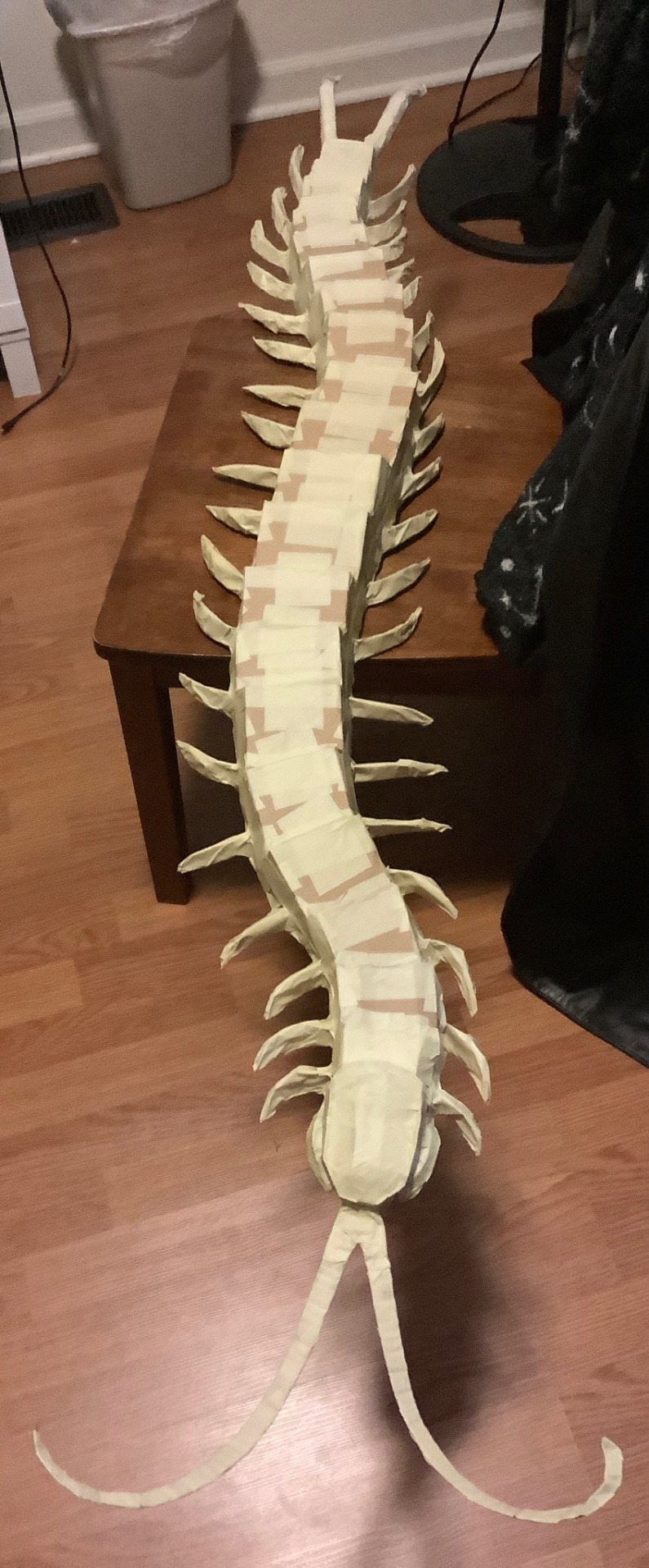
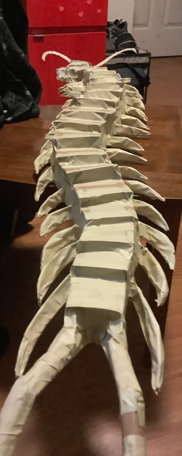
The worst part, taping everything. I used tape to further shape it how I wanted but that meant going over parts several times. I used 2 different widths of tape for this for efficiency but it doesn’t matter. The legs were very loosely taped and if squeezed then they’d lose their shape; I didn’t bother filling them in because I don’t have materials for that and I let the paper mache help support them instead. Tape was also used to fill any holes and gaps left by the cardboard skeleton.
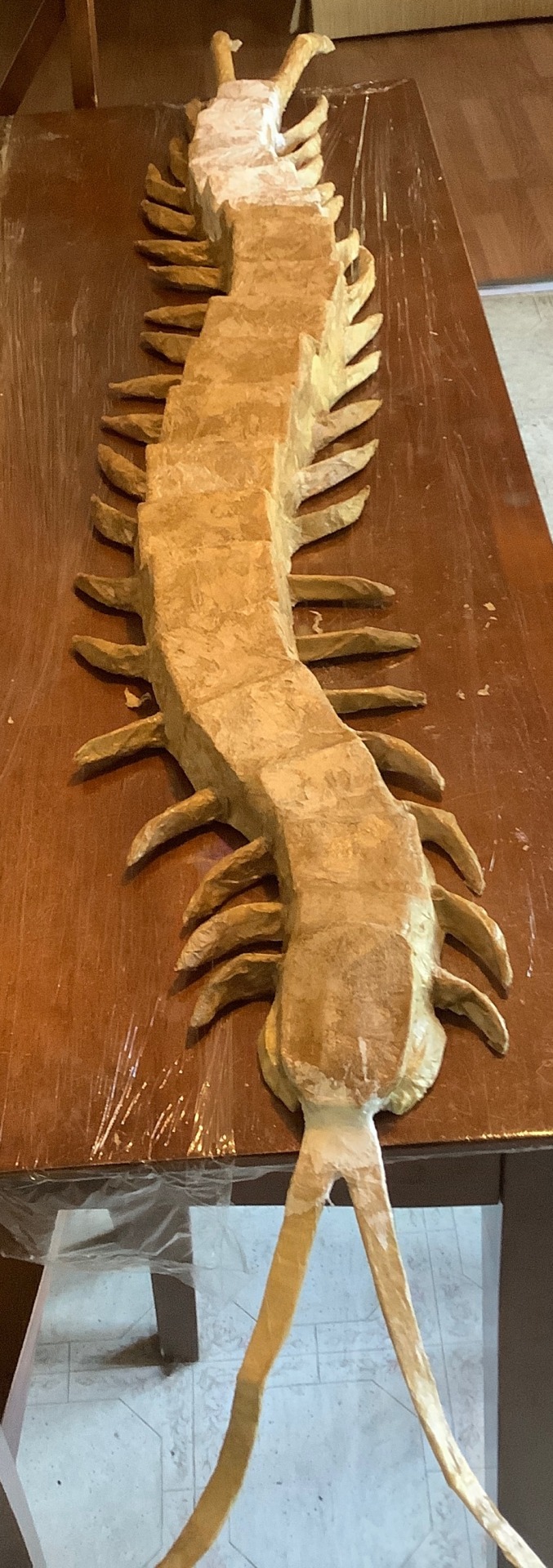
The next phase is paper mache of which I haven’t done since 5th grade… I was not confident in this step. I used mod podge and a brush to smooth down the paper. Because I lacked materials I used fast food napkins instead of newspaper which worked totally fine, it just tended to tear a bit easier. Some areas required me to get hands on and I don’t really like the texture during this stage so that was fun (lie). I didn’t do too many layers, one for the body and 3 for the back and legs but some projects might demand more. I used half of a 16oz bottle of mod podge btw so please get more than you think you need.


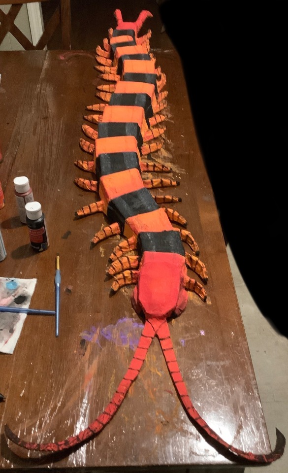
Finally, texture hell!!! I did a base coat of white spray paint and painted everything else with acrylic. Start with your lighter colors first before doing darker ones! I originally mixed some yellow and orange for the body and realized it was too bright and so covered it with orange instead. It also wasn’t until later I realized I could’ve been smarter with my paint so I skipped over the segments that were going to be fully black, saving the orange for the rest of the body. I wanted my centipede to stand out and not look 2D color-wise so I also used the red for the head and tail to give gradients and edges to the orange segments and legs, later going back with burgundy to further darken them but not too much. For the black segments I also used a very watered down layer of sky blue to give a fake shine and show the intended structure of the segments. Do not be afraid to use your hands! I used mine to smudge my detail paints like the black fade on the legs and the back shading. To top it all off I sprayed a clear coat and punched two holes in the underside to hang it up, using thumbtacks angled upwards.
619 notes
·
View notes
Text
My Watercolor Process
Thank you for 1000 notes!!!
As promised here's a post on how I made this painting and the materials I use (. ❛ ᴗ ❛.)
Also commissions are still open!!! If you have ideas I will help you bring them to life <3 Please see my pinned post!!
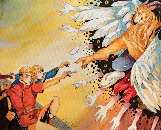
Process info under the cut vvvvv
First some materials!
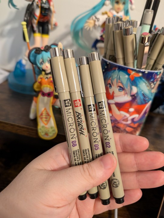
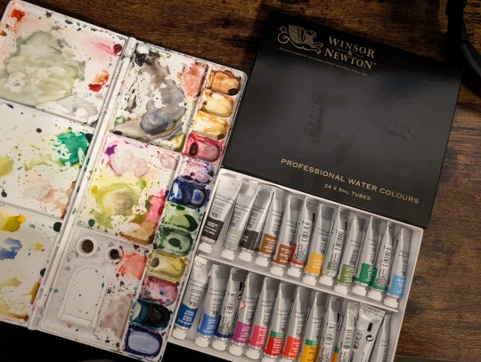
Line art: I use Sakura Pigma Micron pens for line art. The ink in these pens are waterproof after they dry, which is very nice if you want clean line art. Usually I do my line art with a 005 size tip, and then I come back through and thicken lines and add shadows with a 03 size and brush tip. I'm still learning new ways to do lineart, but this is my current go-to.
Paints: I use Windsor and Newton paints. I haven't really tried others, and I have a few mixed feelings about some of the colors and how well they mix with others... Especially cuz this was an expensive set. Thinking about trying a new brand eventually but that's what I'm using for now!
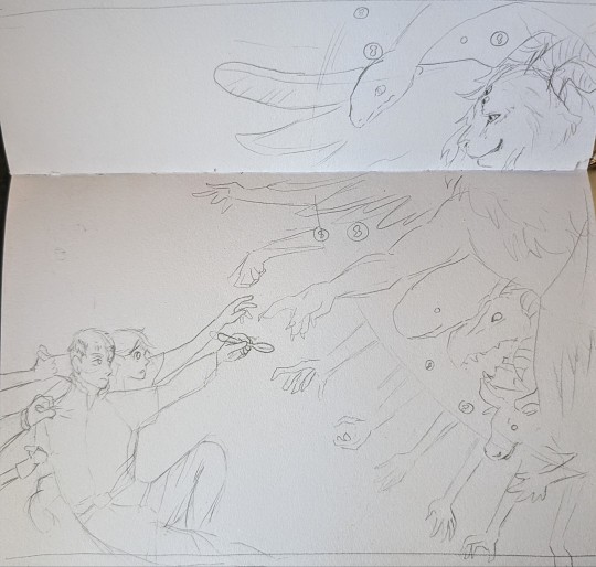
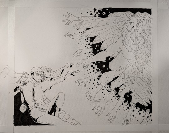
If I'm doing a bigger project I usually brainstorm it first in my normal sketchbook. Here's the brainstorm for this one. Sometimes I feel like certain aspects of the initial sketch look better than the final piece, haha. After this I normally will free hand redraw it onto watercolor paper, I don't like to trace things over. Then I'll do the line art, allow the ink to dry entirely, and erase the pencil underneath
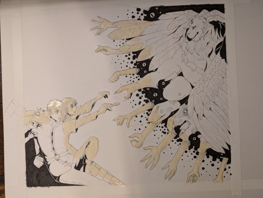
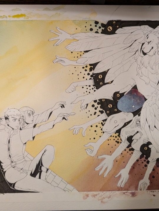
If I'm doing a big or complex background normally I'll lay down some masking fluid. This essentially seals the paper in some rubber so no water or color gets in, and then you can rub it off when you're done with the background. My masking fluid is really old and nasty so it's hard for me to get clean edges with it, but it does the job well enough!
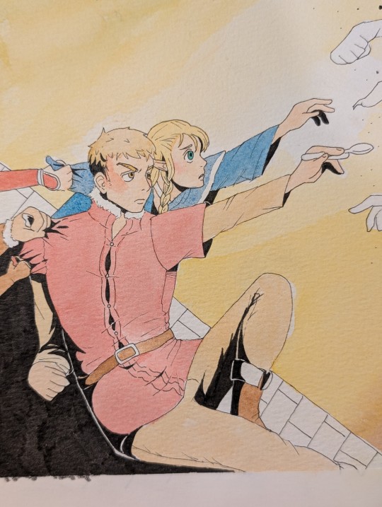
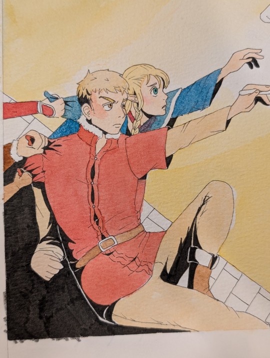
Something really important to watercolor if you want vibrant colors: layering or using less water! In this case I did layering. Here is a side by side of Laios and Marcille with one layer of paint vs. two layers. The important thing when it comes to layering watercolors is to allow the first layer to dry completely before the second. Otherwise the paint may create strange textures and uneven color.

Something else important to creating vibrant colors with watercolor: taking risk with shadows!! On a whim I chose blue to use for shadows on the Lion's wings. You can really see the difference in visual impact between the blue shaded and unshaded wing. Generally speaking it's recommended to do shadows using blue or purple in watercolor, but I find this isn't always a solid rule. Sometimes it depends on what your base color is and what kind of impact you want. It's taken quite a bit of trial and error to figure out what looks good for me, and even then I'm still out here guessing.
I hit my image limit so I'll cut it off here! If you have any questions feel free to ask (:
#thank you again for the notes!!#my art#traditional art#watercolor painting#watercolor process#traditional anime art#dungeon meshi#dungeon meshi spoilers#laios touden#marcille donato#dunmeshi#winged lion#commissions open#open commissions#art comms open
106 notes
·
View notes
Text
hi everyone!! my wrist is too sore to draw today, so instead i thought i'd share some of my favorite csp assets + how i like to use them! i also linked some procreate brushes at the end of the post!!
lineart brushes:
SU-Cream Pencil: i swear by this brush and i use it very often!! if you lower the pen density and use a gradient map over it when coloring your drawing, it has a nice effect. that's what i did in this drawing here! i also use this brush like i would draw on paper, so as a sketching tool. recently i've been enjoying blending it for shading. the pics below are drawn on one layer; left is more manga style while the one on the right is from a WIP of my singer sargent study, so it can be used for more realistic styles pretty well!


Found Pencil: another pencil brush that feels really nice to use, created by @/pigpenandpaper.
PS style brushes: a recreation of photoshop's (i believe) default brush. very versatile and also blends well!
analog wind variant pen: a nice pen that i like to use for lineart that is intended to have a bit of a sketch look.
zakutoro real g-pen: i used it for the lineart of this piece. although, it was drawn before i started using 600dpi in my works, so the lower resolution might make it look a bit unclear.
sets of rough pens: great for manga lineart with a rougher vibe; some of them have varying line weight.
coloring brushes:
zaku brushes: very nice and painterly mixing! i definitely recommend it for those who like to leave their colors a bit unblended.
softie marker: as the name implies, it's very soft! i like to use it for blush in chibi illustrations.
analog watercolor brushes: realistic-looking watercolor brushes. i recommend using it with csp's default paper textures, or those i linked below!
993 coloring pen: it's very soft and watery, though it can be made more solid by adjusting the paint density. i actually think it works very nicely for lineart too.
rock dog pen: another soft marker brush i like, that i once again also use for lineart and doodles.
thick coating brush set: recommended for paintings that show brush strokes.
cartoon cloud: don't let the name narrow your vision!! this has to be one of the BEST brushes for painting in my opinion, and of course it's great for clouds and explosions but so so much more!! and it's FREE try it try it!!
decoration/miscellaneous brushes:
neon pen
paper textures
symmetry move brush
close and fill without gaps
rope brush
sphere fisheye guide
flash balloon
speech bubble set: a lifesaving collection for comic artists!! dimensions and line weight can be adjusted by using the operation tool.
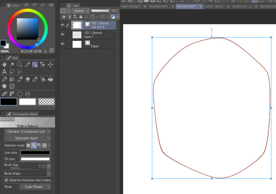
gradient map to use in color mode at 15% and another gradient map to use at 20%: the percentage refers to the opacity of the gradient map layer, but they are just the creator's recommendation and i tend to actually increase it. to use gradient map efficiently, i recommend putting all your colors (and lineart if you want) in a folder. then, right-click the folder, select "new correction layer" and then "gradient map". this allows you to modify the gradient map without worrying about affecting the original colors in case you decide not to use it in the end. to import a gradient map from your downloaded csp assets, click the wrench icon next to the name of the gradient set that's currently in use, then select "add gradient set".


you'll also notice that the creator recommends to use their gradients in "color mode". of course, this is also only a recommendation and i suggest trying as many layer modes as you like! to change a layer's mode, simply highlight the layer and click on "normal" (the default mode) and csp will display the available modes.

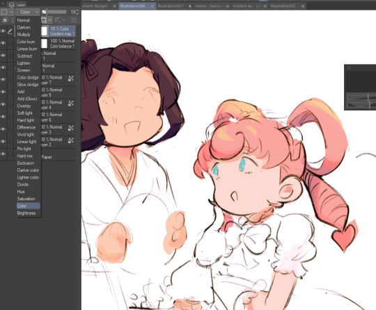
fruit ninja gradient map: fun to use if you want really drastic/vibrant colors! the names of the gradients are cute too, as you can see in the above screenshot!
BONUS: jeremy fenske's free photoshop brush pack: these aren't csp brushes per se, but they can be imported into the program! excellent for environments, i recommend watching fenske's video on how he uses the brushes to get a clearer picture since there are so many in this pack!!
BONUS 2: my good friend clem has a few brush packs for procreate that are ideal for painting,decorating drawings, and y2k-inspired illustrations, i definitely recommending checking out her shop!
in conclusion i hope this post can be helpful to you!! i tried to explain how to use the brushes as best as i could, but feel free to let me know if anything is unclear!! i hope you will enjoy using them! :D
#clip studio paint#clip studio paint brushes#csp#csp brushes#procreate#procreate brushes#brushes#tutorial#art tutorial#sort of hehe
94 notes
·
View notes
Text
Distortion Fanart (michael centered)
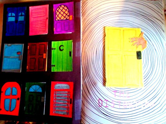
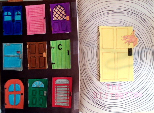
(saturated version on the left, og on right)
This is long, so a break before closeups start!
Closeups:
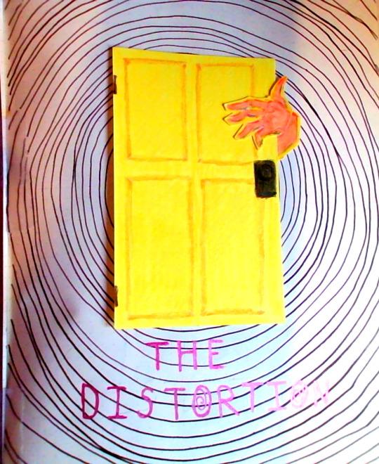
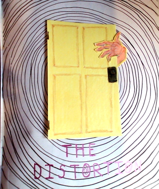
Text reads "The Distortion" (the o has a spiral inside of it)
More closeups but the doors on the left page are open, left to right, top to bottom:
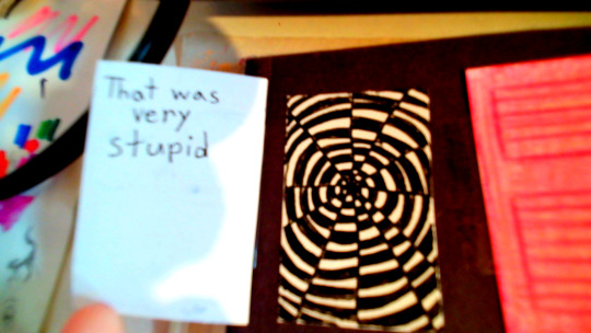
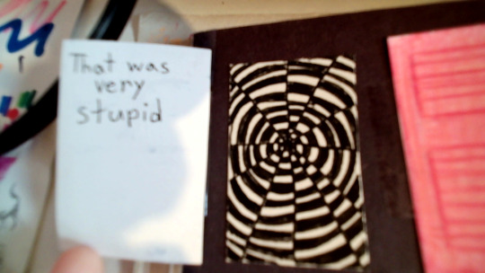
Text reads: That was very stupid
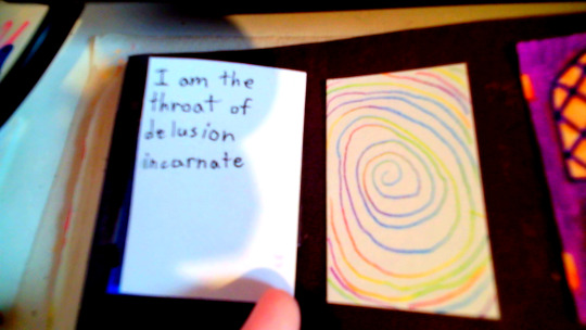
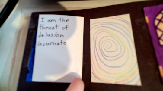
Text reads: I am the throat of delusion incarnate
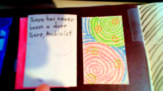
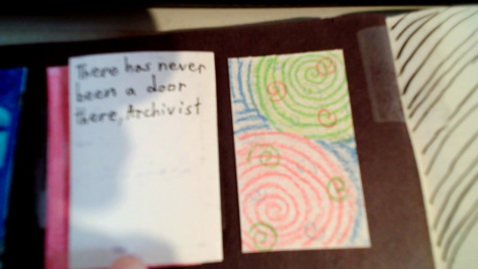
Text reads: There has never been a door there, Archivist
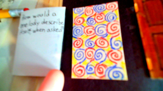
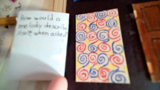
Text reads: How would a melody describe itself, when asked?
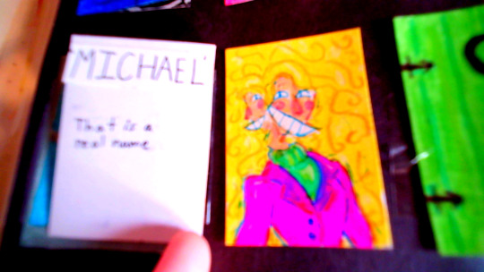
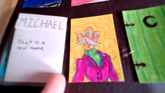
Text reads: "MICHAEL" That is a real name
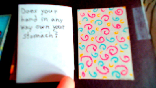
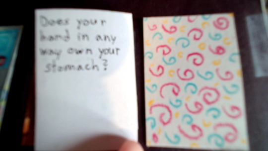
Text reads: Does your hand in any way own your stomach?
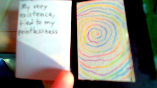
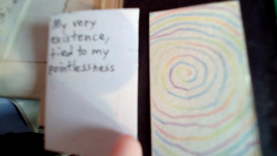
Text reads: My very existence, tied to my pointlessness
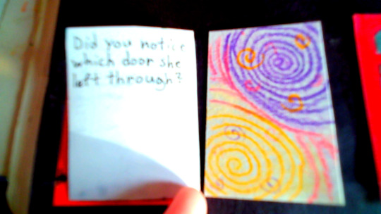
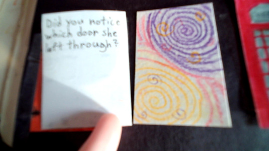
Text reads: Did you notice which door she left through?
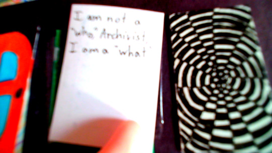
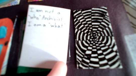
Text reads: I am not a "who," Archivist. I am a "what"
And that's the end of the closeups :D
All the text inside the doors are quotes from Michael Distortion btw. The only exception being "MICHAEL" bc Jon says that, but Michael does respond by saying "That is a real name" so I think it counts as a Michael quote. At least enough to be included.
I'd also like to thank a couple members of the "michael enjoyers" community for helping me come up with enough quotes. I do not remember your names, but thank you :D
The decision to make this spread was fairly impulsive. It started by me doodling spirals on a scrap piece of paper while trying to design a birthday card for a family member. While doing so, I thought, "why not fill a full page in my sketchbook with spirals?" And that turned into "I could make it into a Distortion spread."
And so, we have ended up here with a full Michael Distortion spread.
It was lots of fun to do, and has possibly gotten me out of artblock. Although, trying to come up with 9 unique doors that weren't yellow was quite the pain. Alongside the 9 different spiral patterns inside said doors. (although a couple of the spirals are copies of another)
And now a couple fun facts.
I am currently listening to "More Doors For Me" by elybeatmaker. I thought the song would be fitting.
I have only watched the first 14 episodes of TMA, and none of the TMAGP episodes. Everything I know about TMA is from my sister and Tumblr. For this reason I did only Michael, bc I know him far better than Helen. (she appears less in fanworks)
This spread took me five days. This is because I was either busy, or didn't have the motivation to work on it. The doors took the longest.
There is so much tape. The black background on the left page is black construction paper taped in, the spiral patterns underneath the doors were taped in, the doors themselves were taped on, the yellow door was also taped in, along with the hand and the wrist, both separately taped. It's a good thing I want a thick sketchbook.
My sketchbook's paper is a bit thin, so you can see the spiral behind the yellow door on the back of the next page. (I have since drawn over it, so I don't have a pic)
Each door has a separate color chosen to be the main color of said door. The colors include: Pink, Red, Orange, Yellow, Lime, Green, Light Blue, Blue, Purple, and Brown. The only one that is a normal door color (brown) has Michael inside it.
If you look closely at the right page, you can see where the lines start to get uneven in the background spiral.
I really like the idea of showing someone this spread and have them randomly open the doors, just to see a surprise Michael. :)
Materials used: generic pencil (for the initial sketch) 05 Micron pen random Prismacolors a cool multicolored lead pencil I don't know the brand of kingart twin-tipped brush pens Sipa fineliner pens scotch tape X-acto knife kid scissors black construction paper yellow cardstock A5 Fabriano sketchbook that I hate with a burning passion
Since you read this far, have some bonus Michael doodles!
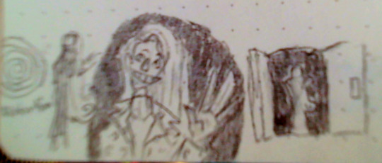
^This one was variations of a scene from a dream.
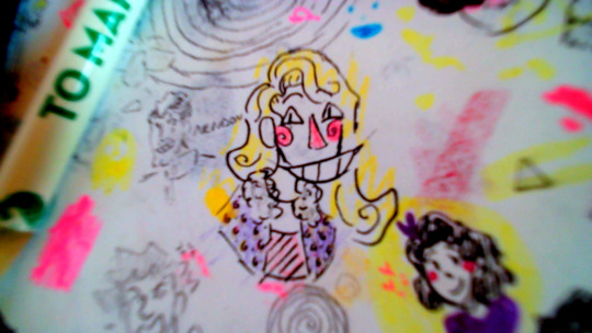
^This one is from a doodle page I have laying on my desk, hence the scribbles nearby. I did not color in the lines (yes, that is nendou from TDLOSK to his left) This was also the first time I ever drew him.
I love giving him spiral cheeks :)
#art#drawing#artwork#my art#drawings#tma fanart#tma art#tma#tma podcast#michael distortion#the distortion#tma micheal distortion#tma distortion#the spiral#spiral#door#michael shelley#the twisting deceit#traditional art#art dump#my artwork#sketch art#sketches#doodle#sketchbook#sketch#traditional drawing#colored pencil#markers#sketchbook spread
35 notes
·
View notes
Text
Notes on Comic Art #2: To Hatch or Not to Hatch, also some coloring stuff
One of the most influential things I've ever read on the subject of comic art is a piece Jesse Hamm wrote on Alex Toth where he talks about flatpacking.
[I discovered while writing this that Jesse Hamm passed away in 2021. He was a brilliant educator, one of the best in the history of the comics medium, and will be sorely missed.]
In the piece Hamm basically discusses how over-rendering objects usually makes them function worse as comic art. Many other people have discussed how using thicker lines for objects closer to the "camera" is good practice, how colors can seperate shapes and create depth, etc.
The question is, where does cross hatching fit into all of this? Or rather, various methods of adding more detailed rendering to artwork? I'm trying to figure this stuff out as I'm doing layouts for my comic, because I want to know the answers before I start inking the final artwork.
I try/want to have an uncluttered, clean, easily readable art style. I occasionally add hatching to my drawings, because hatching is fun, but I often feel like I've slightly ruined my artwork when I'm finished.
I've decided to look at some of the art that I feel like my own work is trying the hardest to emulate, at least philosophically, to see how other artists "weigh in" on this debate. It's important to remember that inkers embellish artwork [hence the alternate title "embellisher"], and so I'm going to try and find inkers most representative of a given penciller's intentions when applicable.
As I was working on this piece, I read Hamm Tips vol 1.1, and I discovered this diagram, which seems to relate with what I'm going to discuss later:

I think it's accurate to say that my desired approach is Uninflected/Deliberate; I think most people going for a clean and cartoonish look fall into that quadrant. Some people might describe Toth's work as being "clean", and so I should clarify that I'm talking about clean in the spirit of "lines meet neatly".
Some of the artists I'll discuss have lines that fall somewhere between being Inflected and Uninflected, and I think a lot of this comes down to inker approach. I feel like, in spirit, all of these pencillers are Uninflected, but some of the inkers use brushes, which creates a sort of middle ground. Brushes add different weights to a line, whereas crow quill nibs and pens have a uniform width. [The technical term for unweighted inked lines is "dumb line"; I believe this was coined by David Mazzucchelli.]
Let's first look at Adam Warren's work in the Dirty Pair volume Fatal But Not Serious. I'm a huge fan of how this comic looks; the flat, cel animation-style colors are very clean and easy to read. It's a very pleasant look, and I'm surprised more comics don't do this.

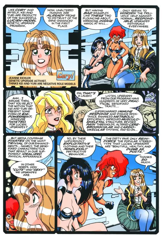
There is some hatching here, but it's not "serious" hatching. Just a few lines on cheeks, hands, etc. 98% of the artwork is shapes delinated entirely by a clean line and color. The convention floor panel is able to have a ton of detail without really changing the visual "rules" of the comic. An artist who does things in a more highly rendered way may've, for instance, reduced the crowd to a series of heavily shadowed figures, or colored in a single expressionistic wash to paper over things, etc.
Warren's Magical Drama Queen Roxy used a very similar approach to Fatal But Not Serious:

Let's now look at Rick Mays. I'm not a huge fan of Rick Mays, I've only actual read a single issue of a comic by him, but as I was reading Gen 13 he immediately stood out as being the best artist on that series, aside from Adam Warren himself [speaking only about issues Warren wrote]. It feels very telling that Rick Mays later did the final art for a graphic novel Warren laid out called Livewires.
These are from Gen 13 vol 2 #70:
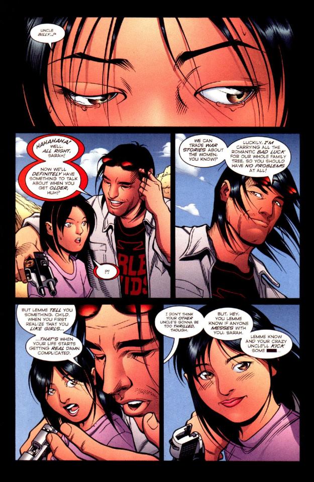
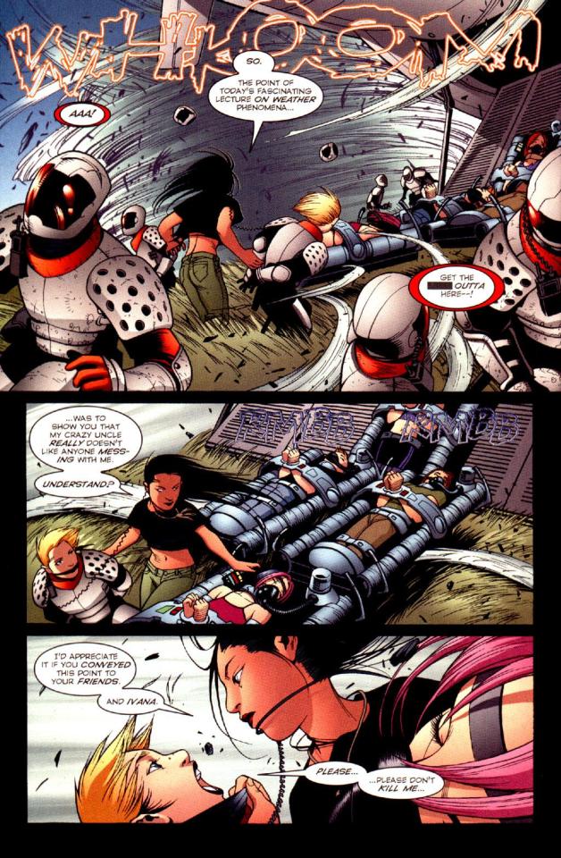
The biggest difference between this piece has nothing to do with Warren or Mays, and everything to do with the coloring approach. I don't think the coloring here is bad, but the gradient-y colors do create a vastly different visual effect than the cel look I highlighted earlier.
The inking approach feels quite similar between the two artists; while Mays's art takes one or two steps towards realism relative to the Fatal But Not Serious stuff, texture is largely used to the same degree [with the grass and tornado being understandable exceptions]. What's interesting is that this issue has three different credited inkers; Karl Story, Rick Mays, and Jason Martin. I'm assuming this happened for deadline reasons.
I feel like I'm maybe starting to sound a little repetitive, and so I feel like I should share an issue of Gen 13 that I disliked, and then we can move to things that aren't Adam Warren-adjacent. These are from #43 and #44, with pencils by Lee Bermejo and inks by John Nyberg:
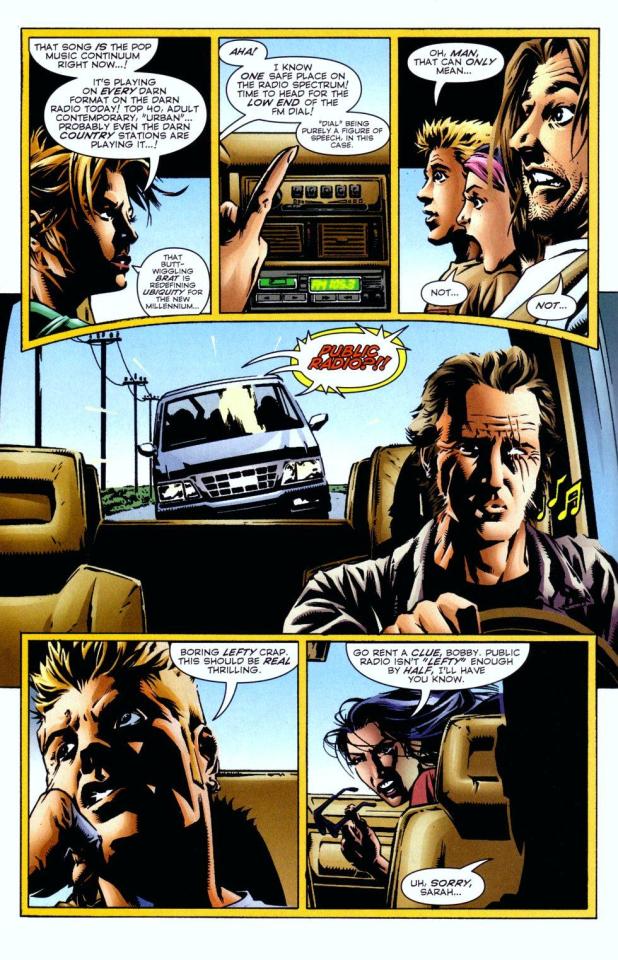
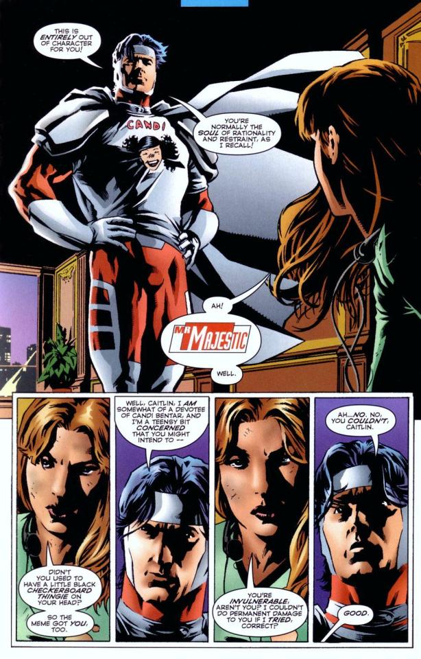
I'm not a big fan of this. The borderline chiaroscuro inking makes everything look heavily referenced, labored, and weird, and the "acting" in the comic suffers because of the over-rendered faces. It's a real shame the artwork is like this, because this two-part story is actually quite solid and would be a minor classic with better artwork.
I notice that many newer comic artists [which is to say, people who began their careers during the 90s onwards] put a lot of heavy shadows on figures in a way that feels too slavishly devoted to a certain kind of realism. I say a "certain kind" because the high contrast look of black spots being put onto a figure make the shadows way darker than they'd actually look in real life, so it almost makes the figures look dirty.
Look at comic art from the olden days and figures are largely defined by outlines/color. If a figure in an old comic has a lot of shadow on them, it's for reasons that are obvious and motivated; noir-y venetian blinds stuff, a mysterious villain being obscured, someone being underlit, or having half their face obscured, etc. There's a clear reason shadows are being used in these cases, rather than it being done to add usually unnecessary detail.
Anyways, let's look at Amanda Conner's work. Image on the left is from a Vampirella story called Fantasy Feast, and the image on the right is from Power Girl #12. Texture is used, like on the walls of the bathroom, but sparingly.
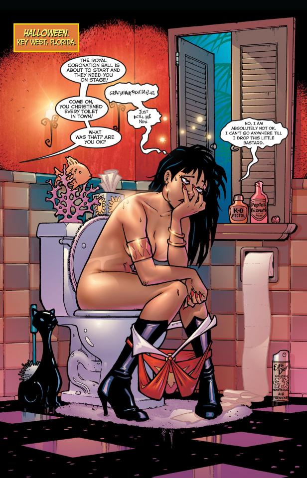
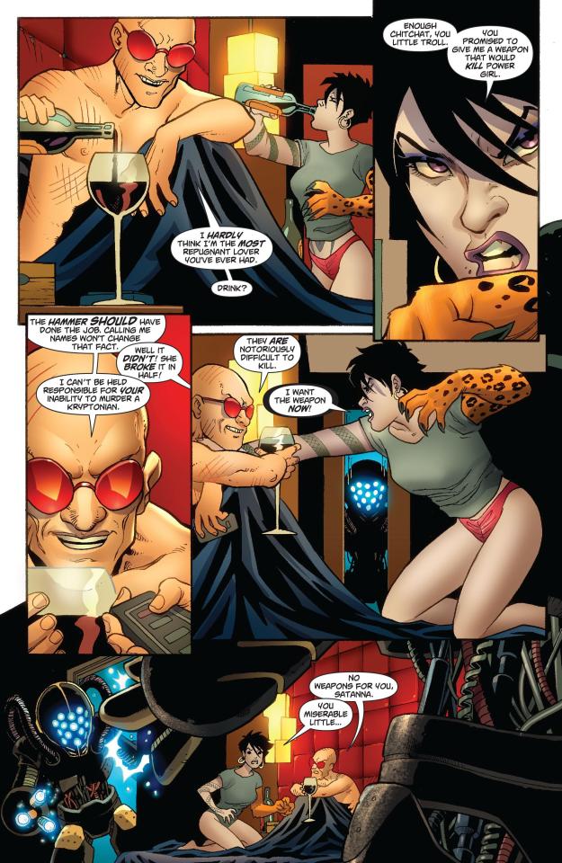
Looking at Conner's work in this context makes me realize, I don't think I've ever seen Amanda Conner's stuff colored flat [at least after she fully matured as an artist]. I don't think the more three-dimensional rendering used in any of these panels is bad, but I'm not going to be doing that kind of coloring in my book, and so it's not quite as instructive to me.
That being said, I really love Conner's style. I've noticed that Marvel and DC are increasingly using artists with styles that are broadly similar to Conner's; I've included an example below. Maybe it's because the artist below is too lazy to draw a proper background, but their work feels so much more flavorless than Conner's in comparison. I think it's because the "acting" is not as impressive, and Conner brings a fun-factor that feels completely absent in the page below.
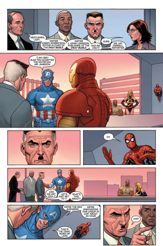
I realize "fun" isn't always the order of the day, but this page doesn't really reflect . . . anything. It's completely bland.
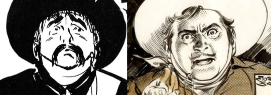
Here's Kirby, who couldn't be bland if he tried. The left image is from the Young Romance collection Fantagraphics put out, and the right is from OMAC. The former is from the 40s, latter is from the 70s. [By the way, the Young Romance image is photographed from my own collection; there's no warping visible because Fantagraphics knows how to design a book].

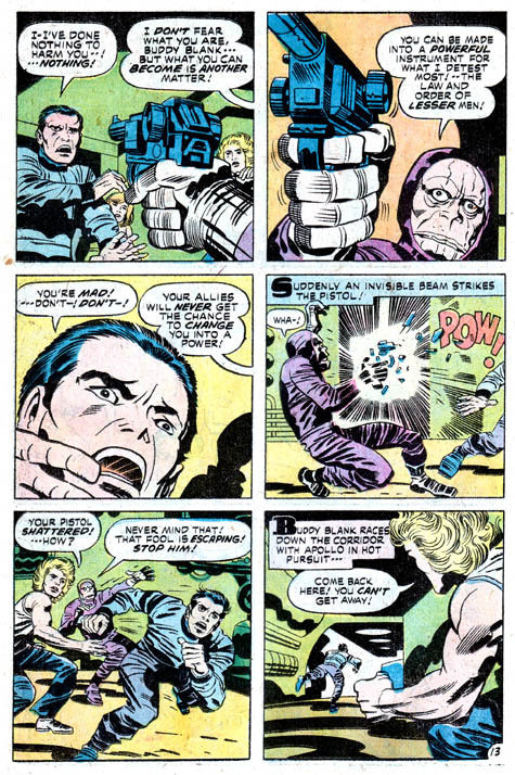
Looking at these pieces side-by-side really challenges a lot of my assumptions about Kirby's artwork, because in some ways his artwork changed less than I previously thought it did without direct comparisons. There are some things that are more abstract about the OMAC page, like the wiggly shadows. Someone unfamiliar with Kirby might assume these were drawn by two different people, but only because 30-odd years of growth seperate these two pages.
Kirby's style, in my mind, is highly geometric and defined more so by abstract shorthand squiggles than hatching or other forms of rendering, but there actually is a fair amount of hatching on the OMAC page.
However, that OMAC page I believe was inked by Mike Royer, or at least someone using a brush. I noticed that, by sheer coincidence, almost all of the Kirby art from my first post in this series was inked by D. Bruce Barry, who didn't use a brush and also followed Kirby's pencils perhaps more literally than any other inker he ever had. In those images, it's clear that most of the hatching in Kirby's work was added by his inkers.
When Kirby did ink himself [using a brush], his style was oddly clean. He did add in hatching, but it was never particularly dense.
Anyways, I want to close this by including some Jesse Hamm quotes from his instructional PDFs:
-Simplicity is great, but often you need extra texture to seel weirdness.
-Another sign of experience is texture. The pro-level artist has learned to give different textures to grass, hair, tree bark, bushes, etc. Meanwhile, the amateur uses the same one or two shading techniques on EVERYTHING, giving it all a samey feel.
-Open spaces of black or white may be "activated" with a bit of texture. A few pebbles/ripples/etc will spur the mind to fill what's missing.
-We talk often about spotting blacks, but spotting greys (i.e., details/texture) is also crucial to clear compositions.
The lesson in the bit of Hamm writing I most often revisited, the flatpacking post, was that too much texture and rendering can make a comic exhausting to read. But reading more of his work, it turns out he had a more nuanced, texture-inclusive view of things.
What's the lesson here? Discretion.
49 notes
·
View notes
Note
Do you have any advice for coloring with markers?
Sure thing!
So I use Ohuhu brush and chisel tip alcohol based markers (I mainly use the brush tip end). And my main tip really if you wanna do shading especially is to get used to how fast your markers dry on the paper. Alcohol markers especially dry really fast. And you can do different things with the colors whether they're laying wet or dry on the paper. If they're still wet, you can blend them much easier. If the ink on the page is already dry, they won't really blend much if at all when you add a new layer.
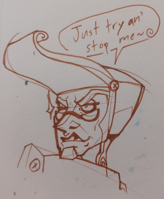
Here's my sketch.
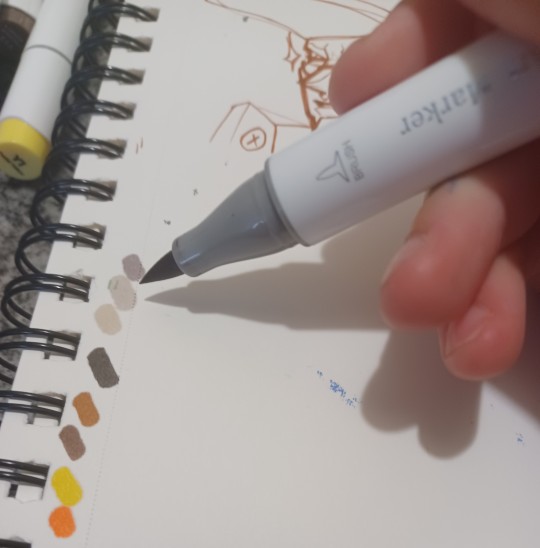
First, I take swatches of the colors and make myself a mini palette I'm using off to the side. I like to plan out loosely what colors I want to use before I start coloring. You can always dig back in your marker bag if you wanna grab another color. But I like to have a starting point palette to use so most of the markers I am going to use are already set on the table. You wouldn't believe how many times I rifled around my marker bag to pick a color to blend with only to put it on the drawing and realize the layer I wanted to blend it with dried already XD
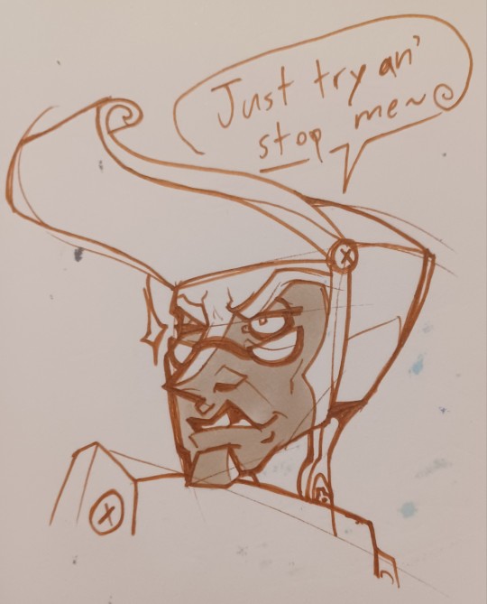
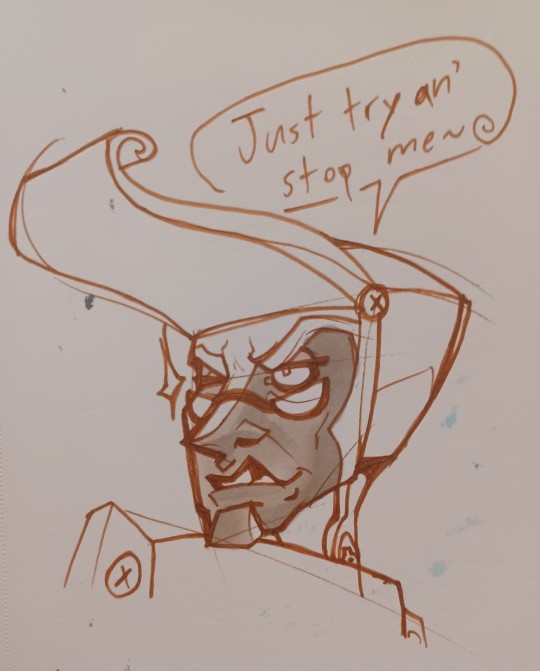
Then I start to lay down my lightest colors, usually starting with the face if there is one in the illustration. The thing with alcohol markers is you can always go darker with the colors (until you reach pitch black or start ripping your paper), but you can't really make them lighter again. So generally speaking: start light, work dark. Although sometimes if I know something is going to be the darkest color in the palette without much variation, I will lay that down pretty early too.
I laid down the lightest gray first, and then the slightly darker gray to make a softer gradient on the face to subtly show where the light is hitting. I'll add a harsher shadow later.
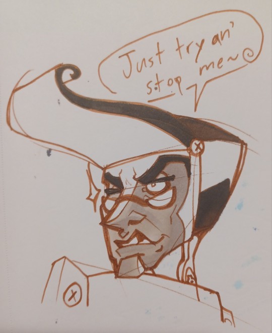
While I waited on the face to dry, I did lay down the darkest browns I was using. First I put the darkest one down and blended it with a slightly lighter dark brown to add some subtle lighting even to the darkest areas.
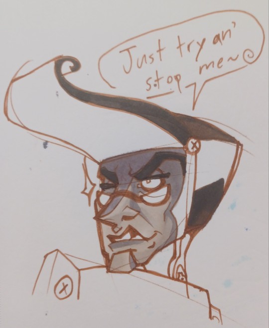
Then I returned to the face once the first gradient layer dried completely. As you can see the darker gray isn't blending with the lighter grays because they're already dry. It just stops abruptly to create a harsher shadow.
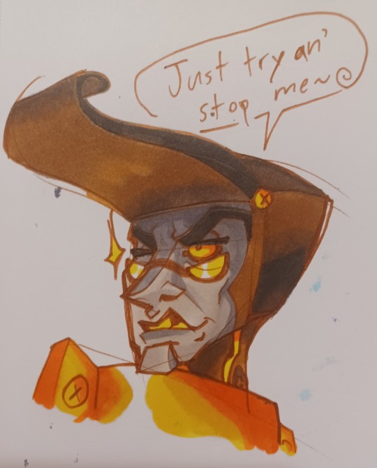
I rinse and repeat making gradients, letting them dry and layering either a flat shadow or another gradient on top until I'm satisfied with it. Or until I'm sick of it lol.
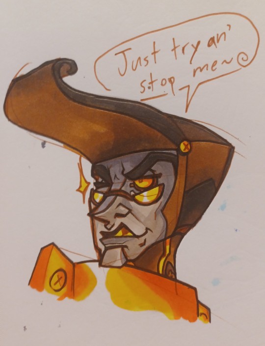
Then I add my lines in a darker pen, hiding any slight bleeding of the marker outside of the sketch lines and also just to make the lines darker and bolder because I like that look. Do a couple extra color touch ups when the pen dries too.

And I wanted to wrap this piece up with a couple background details. Bam!
That's sort of a peek at my process with markers. It's a lot of timing. Making gradients and layering and getting to know your markers so you get a sense of how fast they dry. Hope these tips help you!
49 notes
·
View notes
Text

𝐓𝐇𝐄 𝐅𝐈𝐑𝐒𝐓 𝐐𝐔𝐄𝐒𝐓𝐈𝐎𝐍𝐒 Word Count: 2,554. Includes more art from Akari.
The desk was littered with hundreds of papers, piles of them stacked up high enough that the Archangel was struggling to see where one pile started and another ended. In front of him was a half rolled up scroll, the pen scribbling methodically across the bottom of it as he wrote. Notes taken, lines written down, paragraph after paragraph. Another problem in the clouds left to the Sword of God to have to deal with. He would have loved, at some point, for things to manage themselves but if it hasn’t been managed after ten thousand years, it won’t now.
A knock on his door pulls Michael from his writing and he raises his gaze slightly from his paper, watching as the Messenger of God slipped inside the room. The door was shut just as quietly behind him, the other’s long blonde hair pulled up onto a bun today. Neat, posture perfect, shoulders squared and a gentle smile on his face. Yet, as kind as it looked, there was a tense line to it that Michael noted quickly. The pen was placed to the side and he leaned back in his chair, watching his second in command approach the desk.
“Good morning, brother.”
“Gabriel.” His gaze flickered across his profile again, noticing each of the creases of stress, the hands that were held behind his back. “Did you need anything from me?”
“Ah. Unfortunately I do.” If it was anyone else, he perhaps would have felt more annoyed. But Gabriel didn’t dump things on him needlessly. He actually knew how to take care of things on his own, and tossing them at Michael was a last resort. One he tried hard to not do, and Michael appreciated that. Which means as his brother rolled his shoulders and seemed to tense a bit more, the angel simply waited patiently. “Father has, um, requested you.”
Oh.
Out of anything he could have told him, that was not what he expected to hear. It was rare that God wanted to talk to any of them. Typically, the old man sat in that white cloud realm of his, in that overly large gold and white chair. The stone crystal-like pillars in that holy bright room of his. Things were so empty and echoing in there that the slightest sound carried like it was a large wave. Drowning and suffocating. Reverberating to your very core in terrifying ways. None of them actually like being in there when they’re summoned. Now it seemed it was apparently his turn to do that.
“Very well.” Pushing his chair back he stood and turned in place, grabbing his white coat from the back of it and pulling it onto his body. Michael fixed it properly in place, brushed his hair to fall more neatly where it was meant to and then dropped his hand to the keys settled around his waist. “I’ll let you know if it’s anything important, Gabriel.”
The entrance to the realm where their Father lived was inside the Golden Palace where all the Archangels resided. The secret to actually getting into it though was a key that only a select few of them possessed. The key was more symbolic than actually needed, the power that coursed through it was what actually gave entrance into the Father’s Realm. The door itself was passed the garden, nearly on the opposite side of the entrance of the building, guarded by two wing shaped doors. Pure white in color, an intricate golden waving design wrapping around the edges of it.
As long as the key was on him, all Michael needed to do was pull one of the doors open and quietly slip inside, tugging the large handle behind him as he entered to close it once more. Immediately the overly bright purity of the space attempted to blind him, the lights brighter than even Heaven itself. The silence was about deafening, not even animals living in this space that the Father had created for himself.
An escape was what it felt like. A distance from everything he created. A reason to not be involved. Whatever it was, he’s long since grown numb to the information that God had shut himself away and left them to more or less fend for themselves. Sometimes he has to wonder, briefly and fleetingly. When the humans pray, does he still hear them?
He takes the first step in the direction of the second set of doors that closed the actual throne room off from the hallway. The heels of his shoes clicked loudly in the empty space, his gaze briefly flickering across to take in the tall, pure white and crystal standing pillars that held the place up. Along the edges of them, bordering the hallway, were statues with eerily dead eyes. Built into the shape of the place and reminiscent of the ones on Earth. More accurate though to what angels actually looked like. The six and less wings depending on the angel in question. Being the only things in the wall, dead hallway, there really wasn’t that much to look at.

Finally reaching the white doors the Archangel took a deep breath and attempted to strengthen himself before grasping the handles of the door and yanking them open. One step after another, he dragged himself inside the room and allowed the doors to fall shut behind him, the sound painfully loud and announcing his presence. Not that God didn’t already know he was there the moment that he had stepped a single toe into his realm. Still, the sound was horrifyingly announcing in his mind, and he swallowed back the growing nerves as he chanced a risk at the man on the throne.
The single large eye he had was focused on the book beneath him, the form masculine today though he has been prone to change it or go with neither. Like with most of the Archangels he had gone with the more modern form of dress. A bright white suit, a sharp golden vest and a matching pair of white pants. There were no shoes, and that he thinks was more just a fact that he never quite got used to wearing them.
Strange creature, for sure.
When God doesn’t speak, Michael feels it’s inappropriate to interrupt his book and thus turns away from his staring to focus on something else. Anything. Almost desperately to push aside this discomfort that was rattling his very bones. He ends up staring at the glowing bright yellow and red ball of light in the near middle of the room, a magical portal that gives insight into the various things in the realm. This time, God seemed to have it focused on Hell itself. Michael takes a step closer toward it and blinks at the sight of his brother. Lucifer, outside some tall building with a revolting choice of name, talking to the girl who looked just like him. A clear mirror image of his own twin. That had to be Charlie.
Michael had read the report from the last extermination, the attack on the Hazbin Hotel. The premeditated attack that had been threatened to happen during Charlie’s visit to Heaven. Something he had not known about because Sera deemed it not important enough to take it to people as high as the Archangels.
Michael hadn’t seen Lucifer since the war in Heaven, and he’s never laid sights on Charlie. It feels–weird to do it like this. Impersonal and invasive.
Was this how God kept tabs on all of them? Well, it wasn’t as if it was a secret. He’s always watching was a phrase that the humans coined yet seemed quite true.
“Do you regret your choices?”
God’s voice echoed loudly in his head, reverberating through his very chest as it reached Michael’s ears. The Archangel had his back turned to his Father, his gaze focused on that image of Lucifer, that very bright smile on his face as he engaged with his daughter. Truly caring for her with every single fiber of his being. It was noticeable. He took in the sharp pointed teeth (very weird), the bright rosy cheeks that adorned his face, the flickering of a tail of all things behind him. The distraction did not take awake from his ability to focus on the other being in the room though. It never would. God would be seen and heard when he wanted to be.
And his question was one that struck Michael right in the lungs, practically stealing the air from him. He knew what that question was for, he knew what his Father was asking. The unspoken details, the further questions, the meaning behind his words. Since he got that letter on the exterminations, since he heard what happened during them, the question that had started to be asked had dug itself further into his head. As had the regret over the exterminations the moment he saw Sir Pentious in the Office of the Seraphims.
Sinners. Being redeemed.
The apple and free will.
What was truth and what was lie.
What was a mistake and what was right.
Does the crime fit the punishment.
Was the devil right.
There are questions one doesn’t ask in Heaven. There are things you’re not allowed to say. For Michael, any thought that went against the Grand Design, the Heavenly Order fell in line with those things. They were dangerous to ask and if your halo cracks you’re no better than Lucifer himself. Another angel tumbling from the edges of the clouds, falling apart and crashing toward the ground. Fleeting, broken, fallen.
The answer to the question that the deity posed should have instantly been no. That is the answer that he should have given to him. No, no, no. He doesn’t regret his choices, he doesn’t regret the war in Heaven, he doesn’t regret pinning Lucifer to the clouds, he doesn’t regret the exterminations. Sinners are sinners and they should be tortured and punished for the crimes they committed. For turning off of the path of holy light, from falling from God’s Grace. They deserve to rot with the King of Hell who gave that apple away and gifted them the ability to be horrible, monserious creatures.
And yet, the answer doesn’t come.
Those words don’t leave his mouth because they feel wrong. They feel unfinished. Like a thought he is meant to have but he doesn’t actually believe. A thought that should already have been found inside of him yet feels forced into his mind. And that was wrong of him. He was supposed to have unwavering faith and devotion to the being behind him. So why can’t he say he regrets the things he’s done?
What comes out is something entirely different.
“Do you think Lucifer was right?”
To give that apple away in the first place, to believe so strongly in the humans in Eden, to want to see better for them and to free them from the chains of Heaven? Was the apple right and Eden itself wrong? Is paradise only a thing that can exist if people are controlled to believe a certain thing and told how to act? Does what one person sees as right being wrong for someone else make sense? What is right and what is wrong?
Again his gaze flickers across his brother’s face and finally Michael turns away from the image of him, feeling just the smallest bit braver, enough to continue speaking. “Are not all sins equal? Does someone deserve damnation for what they did or does the reason it happened play a part too? Can they be forgiven for them and let up here? What about the victims who reside in Heaven? Should they have to share space with the people who harmed them? How do you make the crime fit the punishment when things are weighed so differently? What is free will?” There’s a hitch in his words, his voice lowering as that doubt grew more, his words tapering off as he realized again who exactly he is asking these things of.
What does it mean when the Angel of Faith questions God?
There’s the sound of a page turning, loud in his ears and heavy in his chest. His Father didn’t look at him, but he had clearly heard every single word. This was the first time he’s turned a page in ten minutes and it doesn’t take God that long to read. “Is there a right or wrong answer to your question? Is there a right and wrong way to view this? Is the Heavenly Order black and white or shades of gray, as Samael believed it. Are all crimes equal and therefore should Hell even exist?” The book is shifted in his lap and God finally picks his head up to look at Michael.
“I can read your questions as easily as I can read you, Michael. Just as I read them in Samael before he gave Eve the Apple of Knowledge.” That had him tensing up, the thought he was starting to question things like Lucifer. It was a common saying up here; that if you questioned too much like the devil you would fall as he did. None of them want to end up like that, thrown from Heaven for doubting the Heavenly Order. For making the same mistakes as the devil himself.
God either didn’t notice his discomfort or didn’t care. “Perhaps you’ve taken on too much lately. You always try to shoulder the weight of Heaven on your own. Why don’t you go and search for your answers rather than asking me. Come back when you can answer my original question without more forming in yourself.”
That had not been a suggestion, there was no question in it. That had been an order as gentle as God had been in giving it. It was always hard to disconcert what their father was thinking and he never gave anything away himself. Impossible to read and impossible to understand, it often left the Archangels as a whole wondering more things than when they entered the room. Even trying to get a straight answer from Gabriel was never something that worked. At least he stopped talking in riddles at some point, which had made everything worse for several millennia.
With no further need to talk, Michael nodded his head to God and quickly turned around, all but fleeing from the white realm to get out of there. He stumbled briefly, catching himself on the wing shaped doors and with a deep breath tugged them open to sleep back out into Heaven itself. And there, as he leaned back against them to collect himself and his breath, he realized something else that should have struck out in God’s words.
He can read Michael as he did Samael.
Did he know?
Did he know what Lucifer was planning?
Did he know he was going to give away that apple, that he was going to storm Heaven, that he was going to kill and hurt their brothers? Did he willingly sit there while Michael rammed a sword through his twin’s back and threw him from Heaven?
Did he really know and let him do it?
Why?
Why?
Isn’t he supposed to care about them?
ĦɆ ŁɆŦ ĦƗM ĦᵾɌŦ SȺM?
11 notes
·
View notes
Text
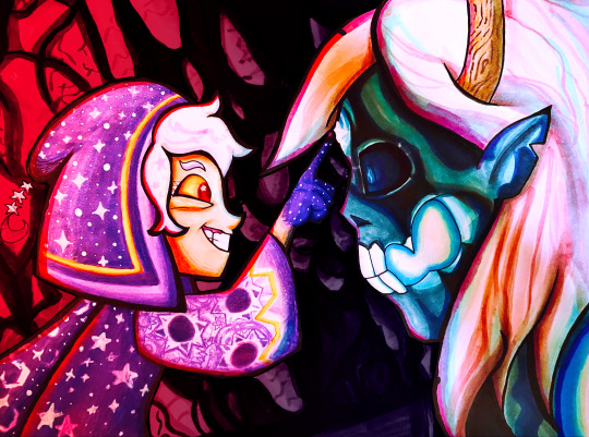
Did a screenshot redraw of that moment Belos knew he fucked up. With markers!
WIPs/links to higher quality under the cut 😌
So what I did to create this image was hold my paper up to my screen and trace over the screenshot's lineart, then worked out the rest of the details on paper. The straight lines on the top and bottom are where the original screenshot cuts off.
Once I decided the sketch was finished I put my blending card (special paper for the markers) over the sketch on a lightboard and traced over it with my pens.
If I made mistakes I would sometimes use my white paint pen to draw over them.
Then, on a piece of scrap paper, I would test out my markers to see what blending combinations looked good.
Tangent: I use alcohol markers, specifically COPICs, though I also have some Prismacolors too. Alcohol markers are built for blending and I recommend looking them up if you are interested. I use copics because they have a brush nib and while they're expensive, you can easily get refills and replacement parts so you'll never throw them away. You can buy 30 year old markers that are still good.
First I colored (most of) the characters (that took a lot of time, especially since I was cautious about how to color in things like the eye and would test on scrap paper first)
Then I tried making a background but I really didn't like it
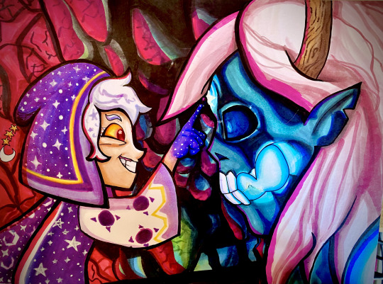
So in digital art I cut out the characters from the background to see how to fix it and came up with the idea of darkening it significantly.
Digital experiment on the left, experiment onto paper on the right.
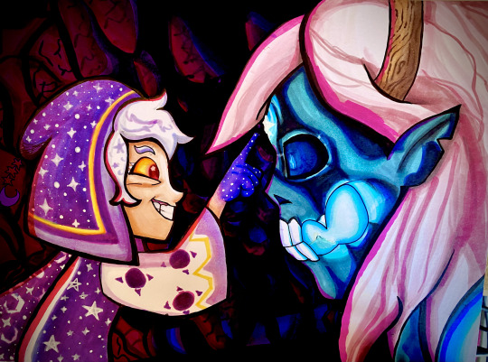
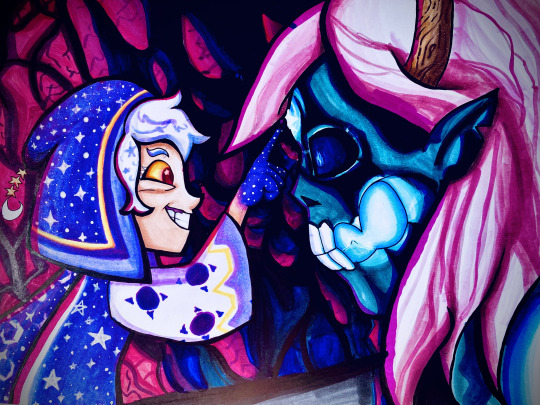
A lot of these WIPs look very different because of me taking pictures of the photo with a phone camera and doing different filters every time. I have a scanner but I've never liked how it comes out.
If you want to see a higher quality version of the final image, here's links to where I uploaded it on Deviantart and Newgrounds.
Also a Youtube upload of that video I made!
Note: There's an animation error in the original ToH clip I used where the Collector's clothes are miscolored, and the reason they're not here is because I fixed it.
#The Owl House#the collector#emperor belos#screenshot redraw#traditional art#quo's art#quo's colors#quo's traditional
69 notes
·
View notes
Text
How I Approach Figure Drawing

Got asked about tips for figure drawing and...I have a lot to say! I thought to just catalogue what I’ve been doing to build up my figure drawing knowledge and habit, so hopefully this is a useful reference for anyone interested in figure drawing :)
make it a habit (but take it easy!)
This is probably the most important and most annoying tip ever lol I’ve been figure drawing for 7-8 years (on and off! I don’t pressure myself if I have other things to do) so it really just takes time. Given that, my biggest tip for figure drawing is to figure out how you can have fun on this forever journey, so everything below is what I do to have fun and maintain the necessary enthusiasm to persist at it.
warm-up before a figure drawing session of myself figure drawing at my desk:

be bad at it on a regular basis
kind of just the principle of drawing....but with figure especially you draw so many of them that it’s important to let your drawings be bad to free yourself of pressure, and good ones will come out just from the brute force repetition of the skill.
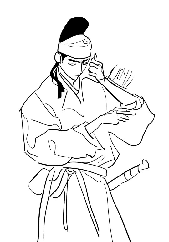
Whenever I feel myself hitting a wall I intentionally revert to letting go of the desire to make a good drawing and try drawing in different ways even if it looks or feels bad in the moment. Some of my favorite drawings are the result of this, it’s awesome how that works out lol
For example, if I’m frustrated by my line work, I’ll start drawing thicker lines than usual and more cartoony (by my standards at least...) to loosen up:

set small goals for figure drawing
The main thing with figure drawing is that to get good, you have to draw hundreds and thousands of figures over time...so to keep that from being repetitive I change up my goal regularly so I can exercise different ways of thinking and keep it fresh, and my drawings look different based on what I am aiming for
Goal of practicing for cleaner lines and using line variety (5 min each):
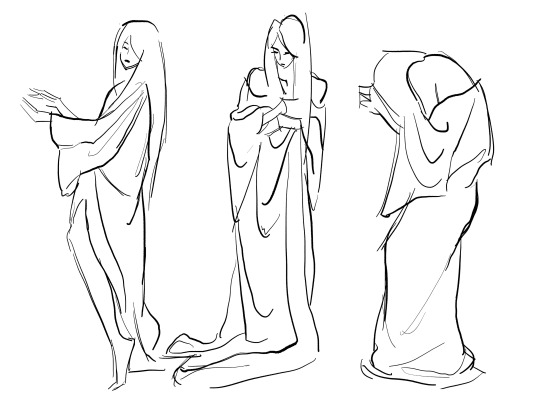
Goal of drawing the lines neatly to color after (10 min each):

A typical progression I’ve seen is to build from drawing nude models to clothed models which is what I did, but honestly just start with what you want to learn the most and you’ll figure out what you want to work on.
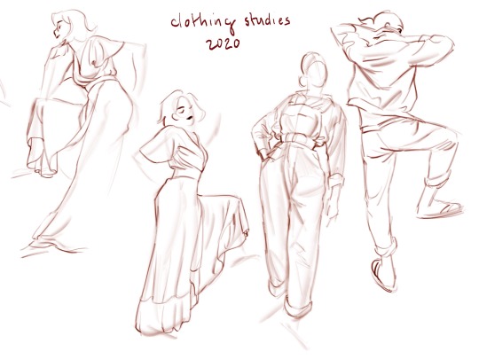
copy other people
When I used to go to live figure drawing, I’d peek at what people sitting all over the studio were doing and copy their method or look. I look at artists online and pull up their work while I draw. I like sessions where there’s an artist demo because I can see what they’re doing (zeet does this). Figure drawing is great because everyone draws the same thing in their own way so it’s cool to see the variety, and it goes so fast that no matter what your references are, it still retains your habits so it’s actually your drawing even when you copy lol
Figure drawing done with heavy reference to Greco-Roman pottery art (4 min for lines):

traditional vs digital media
I switch between drawing on paper and drawing digitally for variety. The material constrains how you draw so it makes each session different from the last and you’ll gain different techniques and discover effects you like over time.
Colored pencil figure drawings with the prompt to draw the model as an animal (5 min each):

Brush pen, ballpoint pen, and felt tip pen figure drawings (1-2 min each):

Also draw at different scales. Try drawing on big paper, try drawing a single pose big, or compose a big page with many small figures.
drawing time
again, variety! Switch up how long the figures each take and how long the overall sessions are. See how your approach and outcomes change based on how long you have to draw. I do long sessions of 3 or more hours less frequently with short 20-30 minute sessions more frequently (I like these short ones lately).
I think persistence and stamina are important for figure drawing, so building up your tolerance for long sessions is a good goal if you are looking to improve. Also, long poses and short poses present different problems to solve, so try them all.
I tend to treat super long poses as paintings so sometimes I’ll color them live (this is a 25 min pose):

short poses I color after the pose ends if I even color them (3 min poses)
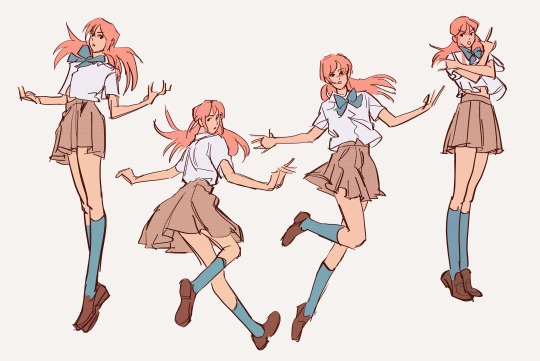
line quality
try drawing with a soft line like pencil vs a hard line like pen, different brushes, etc.

Also try drawing with the constraint that you cannot retrace a line
try drawing with and without an under sketch
how much anatomy do I need to know?
I hate studying anatomy lol I would say you only need as much as you feel like you need so don’t stress over it, but pick up little bits of knowledge and apply them whenever you can.
That said, I thing the biggest help to anatomy for me (other than directly studying it) is to attend nude model sessions in person. Seeing the figure in real life and having to translate the 3D form to paper clarifies what the important forms and connections are to make a clear drawing. These are studies of live models from 2020 after I’d been doing nude models for ~6 years


My figure anatomy big 3 concepts have been
1) construction/proportion – how and where different body parts connect and overlap to form the whole
2) balance/weight – where is the figure applying force, stretching vs. compressing? if the model is stationary, how is the poses stability maintained? If the model is meant to be in motion, what are the directions of force?
3) anatomy from top down – start with very basic anatomy forms like cylinders for the upper and lower arm, egg shape for head, ball and socket for shoulder joint, etc. and build your understanding of anatomy up from there. I get tied down by too much detail so it’s worked out better for me to start with a very dumb anatomical understanding and learn to add nuance over time.
Here’s an example of points 1 and 3 using Teen Titans Slade Wilson (homework for a class I took lol). Break down the proportion, how parts connect, and the basic shapes of body parts and assemble them like a doll. You can do this for any style you want to learn from, and for realistic human figures. This is the basics of “figure construction”.

Internalizing a model that you’ve deconstructed and can reconstruct from memory is the basis for building a “general model,” which is just a generic human body that you can use to figure draw so you don’t have to think about how the body is constructed and can focus on expressing the pose, character, gesture, while maintaining accuracy to a human figure. Here are poses I constructed from imagination once I broke down and understood how to draw Slade.

A lot of this stuff is specifically applicable to animation character drawing but it’s been helpful towards figure drawing for me.
how things look vs. how things feel
I like to switch my focus between drawing for accuracy/correctness (studying the pose, anatomy, etc.), and drawing to capture how the figure physically feels even if it breaks the anatomy. I like to do the pose myself to feel how the model feels, where the stretch and compression of the pose is, and how it feels to exaggerate the pose, and then drawing from that experience.
Some of these legs don’t work anatomically but they feel right and look cool. These drawings came out very twisty and fluid after I copied the model’s pose and exaggerated how the shoulders, waist, spine, etc. were tilted based on how they feel in my body.

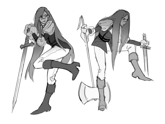
drawing the model vs. drawing a character
Sometimes I get bored of drawing just what the model looks like, so I will use the figure drawing as a live reference and draw something based on the model but as a different character instead and make up new clothes, appearance, etc. It exercises your decision making about what’s important to grab from a pose reference and also trains you to design instead of copy.
These are Gallery Girl LA sessions where I drew the model with a new design:


invent another character to draw a character dynamic (left chara is invented):
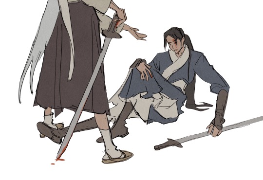
Random tips
I tend to prioritize the pose and full body and leave the head for last or after the session is over so I can spend time making it look nice.

Avoid drawing a perfect vertical or horizontal unless it is important as a design element (if the model is stand straight up and down for example, try to re-balance the pose in your drawing so it has some variety of line direction)
Be choosy about drawing straight lines on the body, save those for silhouette lines, and for internal lines figure out which way the body is bending, moving, or twisting and express that.
Like in this sketch, I tried to add subtle tilts and leans to the model who was posing upright with a mannequin (which I drew as a character):

If you wanted to know about my color process for figure drawing, here! I color after I finish the drawing session and picked out a few drawings to color.
That’s all I got for now! Have fun and draw lots!
a traditional colored pencil sketch where I changed the model’s clothes and expression/body language while drawing it, then photographed and digitally colored it after:

#my art#process#sort of?#TL;DR is u just have to draw a lot of figure drawings and keep doing that forever lol but make it fun for yourself so you can keep at it#this is probably way overkill for what ppl wanted to know but i don't know how to be short i love talking about drawing lol
381 notes
·
View notes
Text
Blank, a guilty gear song, is an ode to the the scientific method... and it's beautiful
youtube
Lyrics:

analysis:
"Don't say bye, don't say bye It's just a short break on the way Don't say bye, don't say bye Now, pick up the map that was discarded"
The song opens by introducing one of the core messages which will be explored... this idea of never really quitting, at least not for long, is told to us through the lyrics of not saying bye. Denying the concept of giving up, and calling it a break on this longer journey, before getting back to work by picking up the map (as in, a roadmap of a project).
"The whitespace was innocent For the man didn't paint with no colors He had a brush and a thick sketchbook But he had so much more"
The whitespace in question is a piece of paper, as the song later mentions, with its innocence coming from a lack of any defining features, as it has no color. This idea of a blank piece of paper being analysed is the main way this song conveys its meaning. Where a piece of paper is usually used to write down information, which is clearly where its value comes from, here the man who is using this paper is described as not leaving anything actually on the paper. While he did have a brush and sketchbook, he found something more in the blank piece of paper itself. The song is stating the idea of refusing to accept a piece of paper as nothing more than a tool to write on, instead suggesting we ought to find meaning in even a blank paper.
"The storm comes on calmly The storm comes on suddenly Keep on walking though it hurts To find a space on a blank paper"
These are the main lines repeated throughout the song. The idea of the storm coming on both calmly and suddenly at the same time is a paradox, and just like that concept of paradoxical impossibility, finding color on a blank paper is also obviously impossible in the same way. The song sets up our theme here, the idea of finding evidence to confirm something which is instinctually false. To keep on walking is to keep trying, to keep attempting to prove something, despite knowing it obviously won't lead to anything. That is what being a scientist is at times, seeking empirical evidence confirm something that we know.
"The storm comes on calmly The storm comes on suddenly He knows how to ride it now To find the color on a blank paper"
Almost like a person trying to prove something but always failing, we are consistently brought back to this starting point of a lyric, the starting idea from which everything else leads, changing a bit every time in an attempt to finally prove the idea of finding something on a blank paper.
"Don't ask why, don't ask why It's just a caprice detour Don't ask why, don't ask why It's time to get back on to the road"
The main idea of the song, that being proving something impossible, is challenged. We are told to not ask why, and that we should get going, as trying to prove something clearly false is a waste of time. This plays as a parallel to the starting lyrics, while those were encouraging the continuation of this project, these lyrics, using very similar words, are doing the opposite.
"The wide space was innocent For the man didn't write in no letters He had a pen and plenty black ink But he had so so much to say"
The wide space is a reference to the white space (with them basically being homophones), this time taking on the meaning of other people who are discouraging of these attempts, yet ultimately innocent due to the fact that they are arguing against the existence of something impossible. The man is again shown to be trying to find something paradoxical in a piece of blank paper. The song started by calling out how the had so much more, which could be seen as potential, but now refers to him having so much to say, while his pen and ink remain unused. While he is talking about and discussing his ideas, he is still unable to find any evidence, thus failing to use his pen and ink.
"The storm comes on calmly The storm comes on suddenly Keep on walking against the wind To find a space on a blank paper
The storm comes on calmly The storm comes on suddenly He knows how to write it now (To) define the color on a blank paper"
This song uses these lyrics ad nauseam to signify the consistent trial and error used to prove something. While struggling, having to now "walk against the wind", finally a conclusion is reached, with the ability to define the color on blank paper, something which will finally answer if you even can find anything on it.
"When he has given out some day What is on his mind? Pointless I will give you that, but I did not want to believe Such words "that's the way it goes" But hey My journey is over with"
Here, the narrator refers to himself in the future as a different person, questioning what he will be thinking the day he finally gives up, a concept he is currently so opposed to he can't considering himself the same person if he does that.
Having proven that his paradoxical ideas about a blank paper are indeed provably false, he admits to the pointlessness of the whole ordeal, but still says he simply wasn't content accepting the obvious truth without proof. Either way, does it really matter? His journey is now finally over.
"The storm comes on calmly The storm comes on suddenly Cold and wet and hurt by rain (But) Keep on walking just go on and on
The storm comes on calmly The storm comes on suddenly Keep on walking though it hurts To find a space on a blank paper"
This time these lines are used as advice to others, even if the rain (all the criticisms you will receive) hurts like hell, you have to keep on moving forward, trying to prove even that which is obvious. To find a space on a blank paper is impossible, yet completely worth trying.
"The storm comes on calmly The storm..
When his time runs out some day Where will his heart be? Breathless I will give you that, but I did not want to believe Such words "that's the way it goes""
The paradoxical nature of the storm is finally solved, with it now coming only calmly, the same way that the blank paper is confirmed to be nothing more than that. Again, we repeat the idea of where will a person who proves the obvious end up one day, but having finally proved what he went out to confirm, the lines after conclude the theme.
"My friend
Yeah I'm a fool Still I know this (The) Wind may blow again"
A person who tries to proves that which is instinctually known is considered a fool for wasting their time, and yet... how can we blame someone for wanting to be truly certain of even that which is known? After all, to be a scientist, to be a human, is to go out and find meaning and proof in everything, and our world, our wind, may only continue functioning as normal when we have that knowledge.
Finding the space on a blank paper is impossible, and yet we must try until we are certain of it, for that is the scientific method, which makes us human.
#guilty gear strive#guilty gear#music#song analysis#analysis#taxes writes things#Guilty gear song#Youtube
11 notes
·
View notes
Text
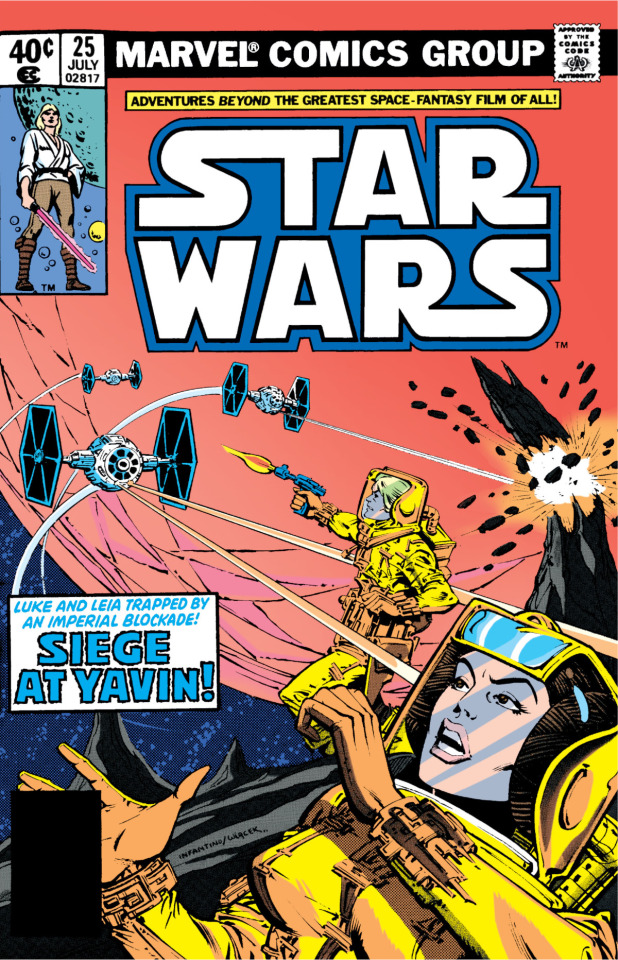
July and August 1979. The unusual transatlantic production schedule of the original Marvel STAR WARS comic, which for a time was published in the U.S. in 36-page monthly color comics and in eight-page weekly installments in the B&W UK series, led for a while to the use of two different inkers for regular penciller Carmine Infantino: Bob Wiacek, who did the cover of issue #25, and Canadian artist Gene Day. Generally, Wiacek and Day inked the stories in alternating issues of the color series, although Wiacek's inks might appear on several consecutive covers. They each gave Infantino's pencils a distinctly different look. Here's a page from issue #25, inked by Day:

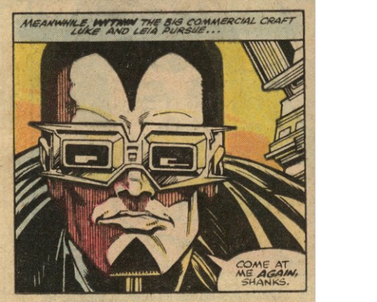
If I had to choose just one word to characterize the work of Gene Day, who died suddenly in 1982 at the age of 31, it would be "intricate." Whether doing inks/finishes or both pencils and inks, his art was characterized by an abundance of textures and small details, many of them seemingly rendered with a pen. Note for example in the second panel above the shading on Baron Tagge's face and the linework of the structure behind him, and the grille structure of the ceiling in the third panel.
A side note worth mentioning here, not related to the inking, is the use of color. Original colorist Ben Sean uses the two-color treatment of the hyperspace shot to segue into three panels with a minimal color palette, which I think is supposed to represent the limitations of Tagge's cyber-vision (without which, as the final panel indicates, he is blind). The digital recoloring has mostly followed Sean's original colors, but they're brighter and more saturated than they appeared on newsprint paper, and for some reason, the recolored version of the second panel has substituted a solid orange fill for the original yellow-orange gradient, as seen below:
The following is a page from the subsequent issue, #26, this time inked by Bob Wiacek:
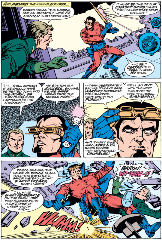
Note that the line weight of Wiacek's inks is different than Day's, and more of the inking appears to have been done with a brush than a pen. There's still some pen shading (note for example the bottoms of Tagge's boots in the final panel), but much less than in Day's pages, and minor details, especially in the backgrounds, feel a bit sketchier. Consequently, Wiacek's figures have a greater sense of solidity than Day's, but their environments are often less sharply defined. (This isn't necessarily bad — from a storytelling standpoint, it may be better not to get lost in the weeds with extraneous background detail — but it does look different.) Note also the Zipatone texture fill in the second panel. Day uses Zipatone as well, but more sparingly and often in smaller areas, where it's often overshadowed by the detail of his line work.
With the release of THE EMPIRE STRIKES BACK in 1980, the UK series was relaunched as a monthly, simplifying production logistics. Infantino did not pencil the film adaptation, but he did the first four post-ESB issues, each with a different inker (Day and Chic Stone, then Tom Palmer, then Day, and finally Carlos Garzón), which led to even more dramatic differences in the look of the finished art. Infantino, who by his own account had no particular enthusiasm for the series, then departed. Gene Day, meanwhile, was doing some extraordinary work on Marvel's MASTER OF KUNG FU series, initially finishing Mike Zeck's pencils and then doing both pencils and inks, which really showed off his enthusiasm for intricate design.
Prior to his death, Day did layouts for two complete issues of STAR WARS, which appeared in #68 and #69 after his death, finished by Tom Palmer. Although they don't have the complex linework of the work Day finished himself, they have a really striking sense of design that make them arguably the most interesting-looking issues in the original Marvel series.
Incidentally, Dan Day and David Day, who did (inter alia) the Renegade Press CASES OF SHERLOCK HOLMES series, are Gene Day's brothers.
#comics#star wars#marvel star wars#archie goodwin#carmine infantino#gene day#bob wiacek#tom palmer#baron orman tagge#house of tagge
13 notes
·
View notes
Note
Would love to write more Naja stuff but still working out how to keep things not too explicit.
For now, hope you have fun with my Monarch's take on Kaela. It's quite challenging since I'm not well acquainted with them and more of a Naja supporter~~
—----------------------------------------------
The Monarch twirls a wooden pen between their fingertips while a small, delicious treat rests on the other hand. Their eyes wander across the ridiculously, large table, watching Kaela sift through the documents. Warm light streams through the glass windows, underlining Kaela’s soft curvature, wrapped in colored robes and the ever-present gloves that adorn their hands.
Serious, quiet.
While the Monarch has yet to catch a glimpse of Kaela’s eyes, they could imagine the politician’s sharp gaze scrutinizing every line, every number, every word on the sheet with the same scrutiny reserved for their interlocutors. Not letting the slightest, potentially detrimental detail slip through while carrying themselves with unwavering grace.
Still, the Monarch couldn’t help but wonder if Kaela has ever glanced their way since entering this room. Let alone notice the past stolen glances the Monarch has been casting in their direction since they first met.
The Monarch did offer to help with work, claiming the need to relearn their responsibilities after years of enslavement. But they didn’t spent hours carefully choosing this outfit- fit enough to accentuate their physique, modest yet exuding allure- only to burn the midnight oil (or rather, afternoon light) without grabbing a sliver of Kaela’s ironclad attention.
It feels almost childish, beneath their station. They’re the Monarch. The yarls and nobles alike view for their favor.
But with Kaela, it feels natural for the Monarch to cater to the politician, one way or another.
With a plan brewing in their mind, the Monarch nonchalantly loosens their robe, letting it slide down their shoulder to show more skin. Slowly, they tilt forward, eyes pointedly engrossed on their own paper, scribbling on the paper as needed, as they take the time brush the sweet treat on their red lips before taking it for themselves.
Hopefully, they can finally catch something from Kaela- a body language, a sound, a response different from their usual mask of professionalism.
First of all, that was adorable of the Monarch. So needy... cute. Kaela is very professional, but sometimes it helps that their veil can hide their expression...
I think the Monarch is truly pushing it with the skin and making use of those lips
#kaela is professional but perhaps a small glance...#fanfiction#tsilw fanwork#kaela#loved it anon💗#also feel free to send in naja content!
46 notes
·
View notes
Note
Hi there! I am obsessed with those TES tarot cards you made. The shapes, the lines, the colors . . . I think The Devil is my personal favorite.
If you don't mind, could you talk about your compositional choices for those? Like layout, structure, arrangement/placement, visual hierarchy, color decisions? Seven years of art school and no composition lessons . . . I'm taking things into my own hands.
Hello !
First of all, omfg thank you so much ?? I'm so glad you like my silly tarot cards :D
I'm really flattered you asked me this question, so I'll try my best to answer it (I'm no teacher and english is not my first language so I hope it will be comprehensible lggklflfifkf)
When you say your an art student who never had any real composition class, I feel you- I've been an applied art student for 4 years (7 if you count design), and apart from really basic and classic stuff like dividing by thirds, the different shots used in cinema, using a little window to help frame what you are trying to draw from life (witch are all very useful), I never really had many composition tips ?
So yeah idk what I'm doing, but that's art baybee
I'll share my process when it comes to designing my cards and hope it'll help lhgktlgofk
I begin by doing little thumbnails (3-4 cm long maximum) with a non erasable pen (or if I'm doing it digitaly, I dezoom a lot, use a big brush and don't erase what I'm doing)
It helps me coming up with big shapes and an interesting compisition (if your doing this on paper, never draw the borders first, it limits your creativity by "putting your drawing in jail" (wisdom from one of my best teachers))
And I personnaly don't use black lines when doing this, because the uglier the lines the less precious I am.
And because I associate dark lines with clean lineart, and this step is about being messy ! So the uglier colors the better :) (for me)
(I'll use two cards as exemples, one I did by doing thumbnails on paper, and the other on my art program)
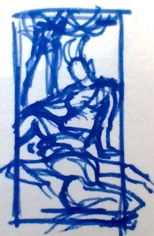
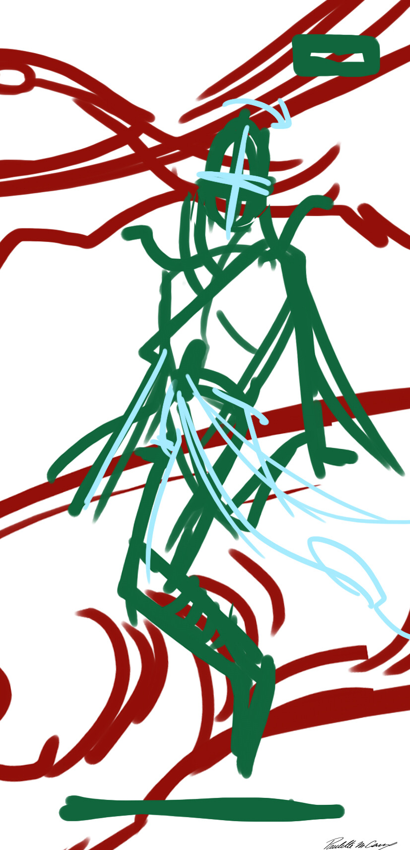
(And sorry I could not use the devil as an exemple, it was one of the three cards I did in class and so I skipped the thumbnailing for time saving :/)
Next step is sketching, still using my ugly colors :)
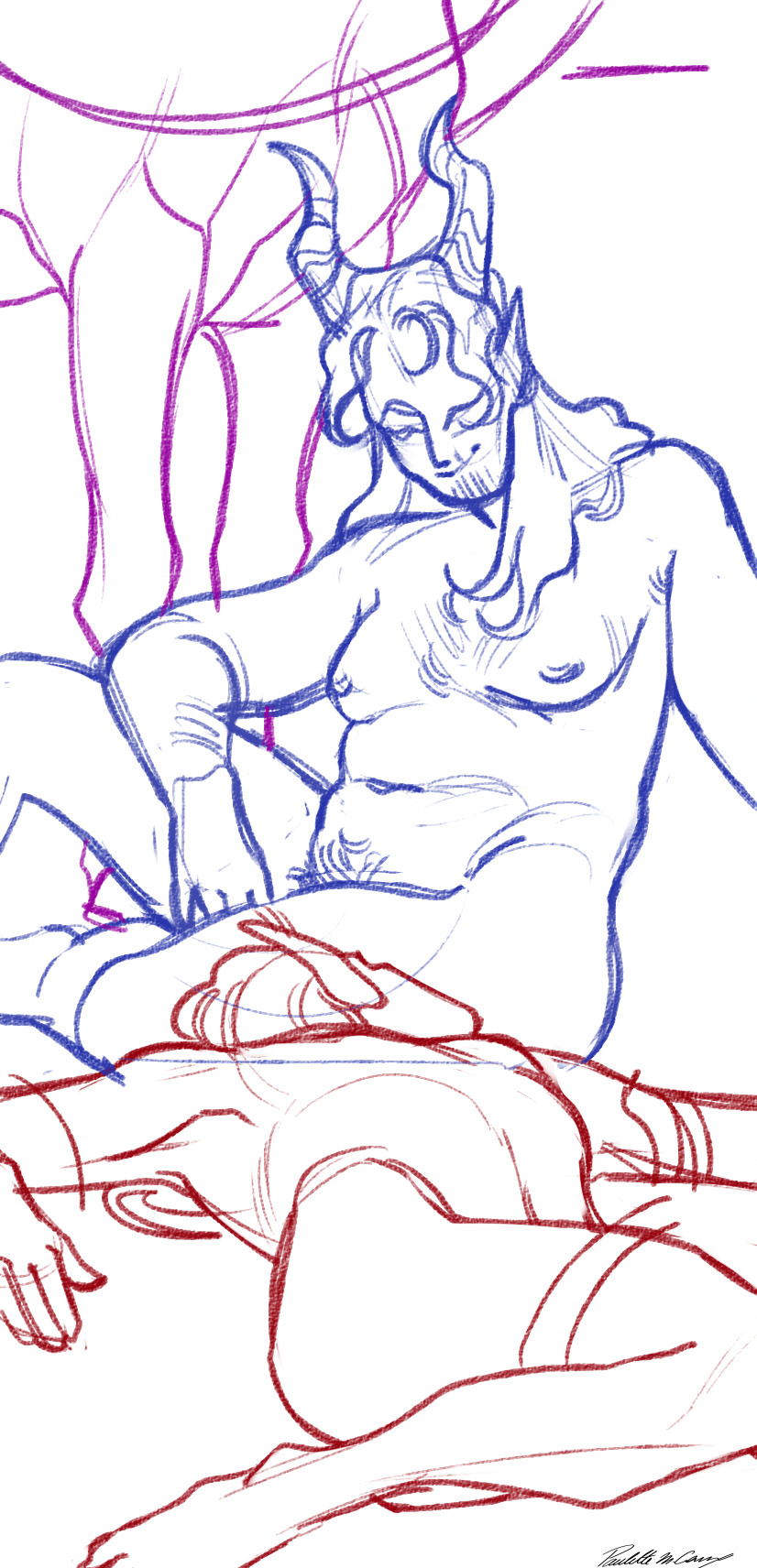
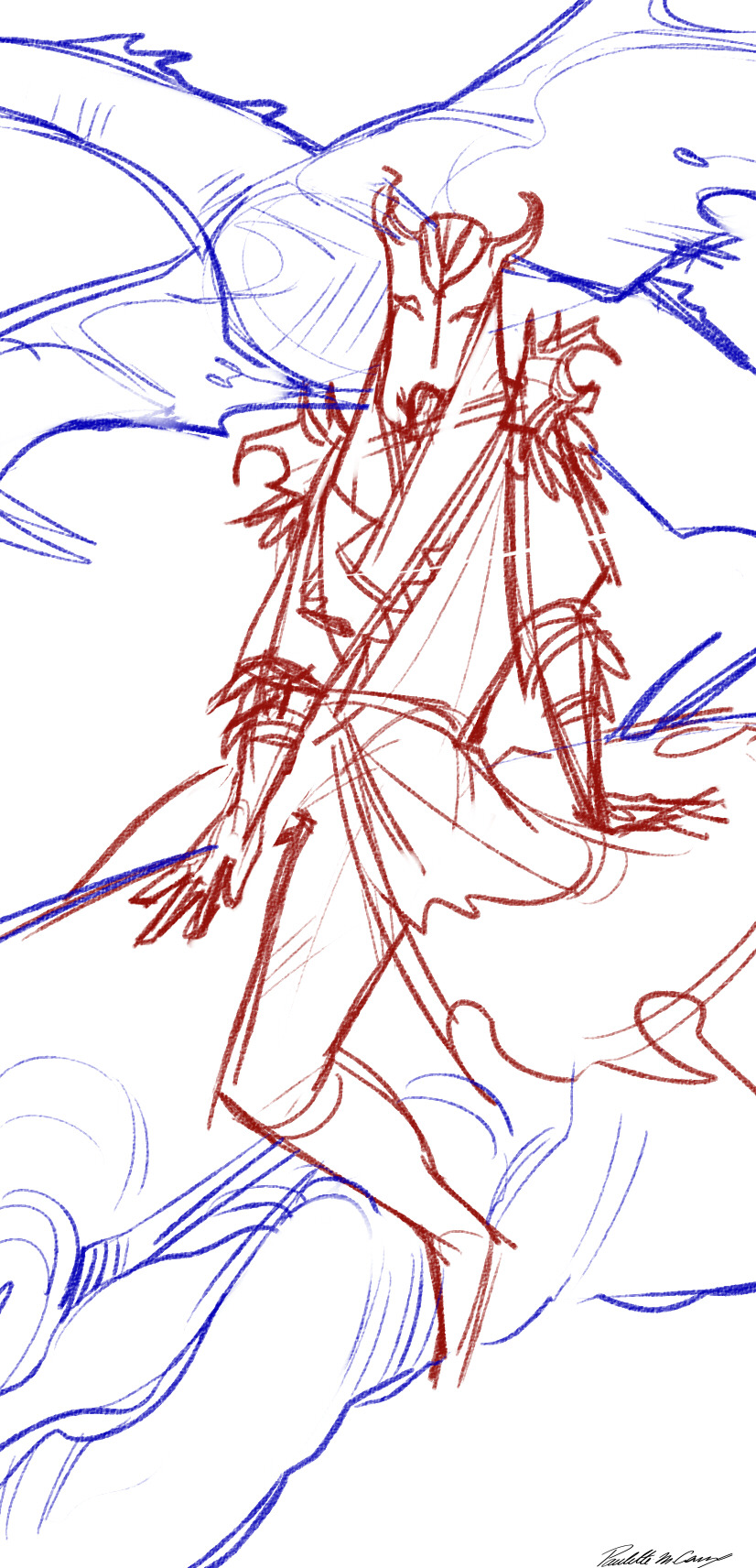
But to talk a bit more about composition, for these I always have the important element of the card near the middle (sanguine's face and his lovers head, and miraak as a whole) (I know trick of the year glgjorlfifjl)
And to help with dynamism, I use a lot of diagonal elements (sanguine's shoulders and hips, his right arm and leg, his is leaning back slightly, and his lover is laid a bit to the left. For miraak he is also laying back, his shoulders are not straight, and his to dragons are going on two different diagonals)
Next comes the line ! For this project I chose to use a pretty simple-ish and stylised look (mainly for time saving since it began as a school project)
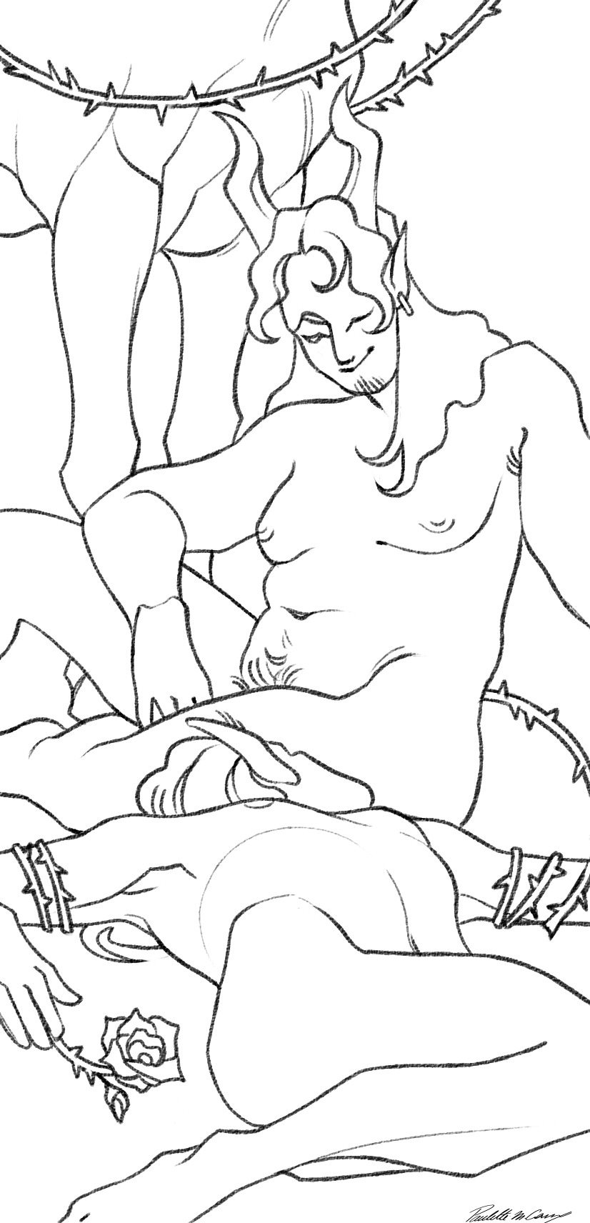
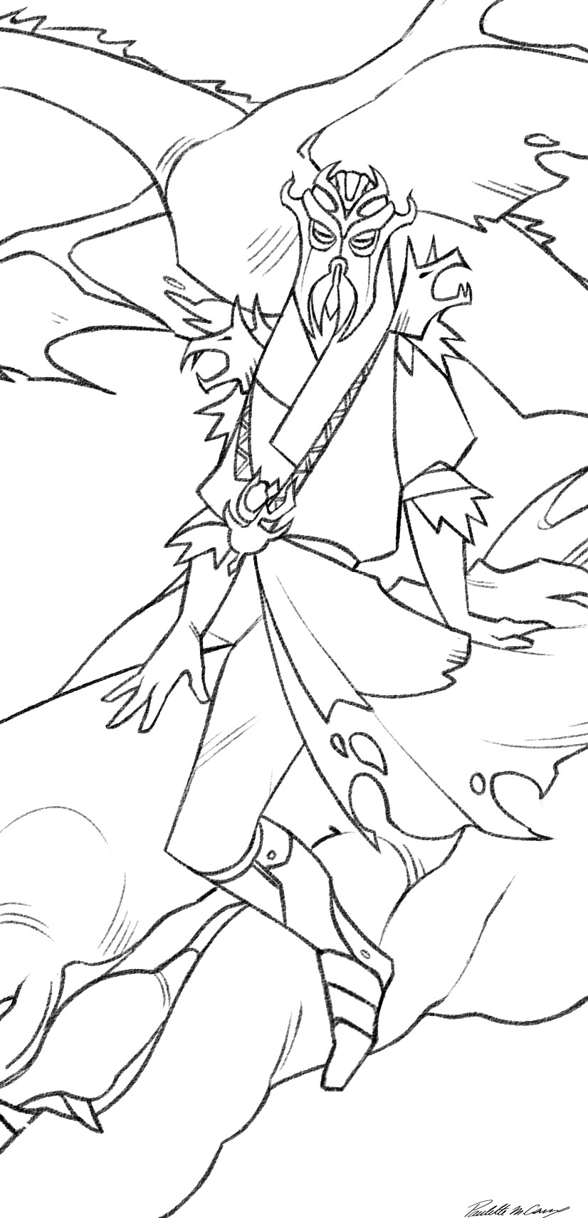
The colors are really simple, I just do a grey scale version then apply an overlay on top :)
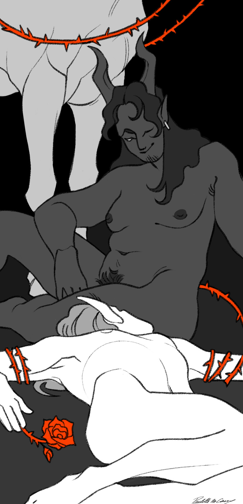
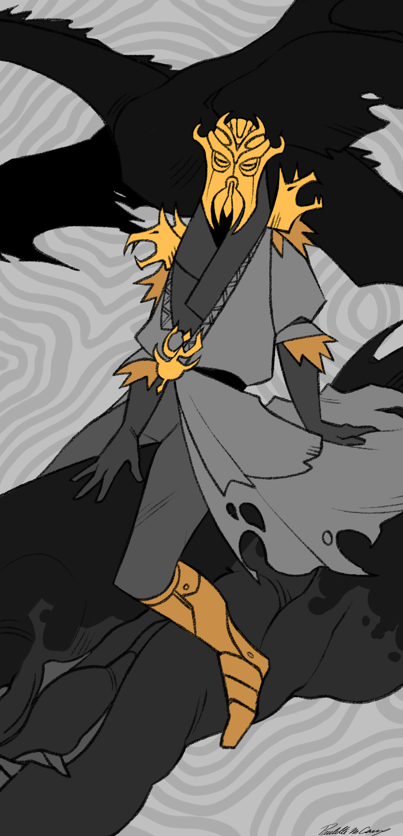
And as a final touch before adding the title, I add a white frame, that I always put behind the foreground to try give them a bit of depth :))
So to sum up my design brief for these :
- clean and stylised lineart
- one color for the whole illustration (exept for the devil because it was the first one I did and I did not know what I was doing glg'goflf)
- a second very saturated color used to highlight important elements (in either yellow, blue, purple or red)
-always have black somewhere
-white frame behind the foreground
-the numbering alternate between the top right and top left (exept once angain for the devil gmgkfnfon I'll have to change that someday)
-the title is always in the middle on the bottom, on top of the white frame
Hope I answerd your question ^^'
thank you again for the very kind message :)
30 notes
·
View notes